AdminForth Components Library
AFCL is a set of components which you can use as build blocks in your AdminForth application. AFCL allows to keep the design consistent with minimal efforts and build new pages faster. AFCL components follow styling standard and respect theme colors.
Components set is always growing, so you can expect new components to be added in the future.
Button
import { Button } from '@/afcl'
<Button @click="doSmth"
    :loader="false" class="w-full">
  Your button text
</Button>

<Button @click="doSmth"
    :loader="true" class="w-full mt-4">
  Your button text
</Button>
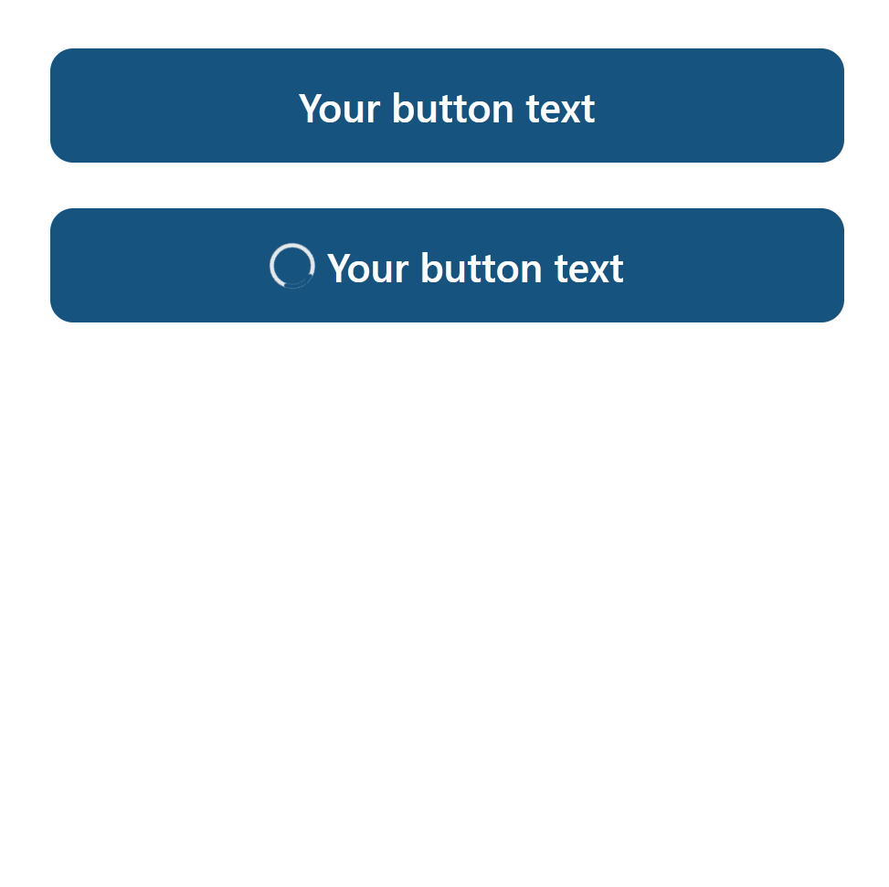
loader prop would show loader when it's true.
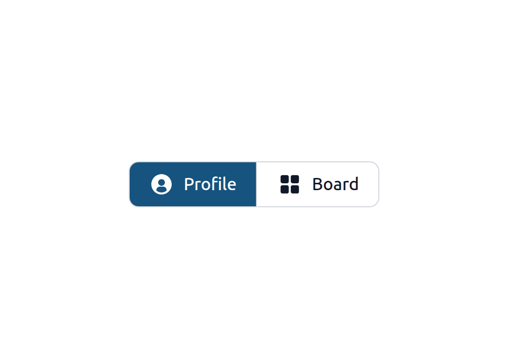
Button Group
With active button
import { IconGridSolid, IconUserCircleSolid } from '@iconify-prerendered/vue-flowbite';
import { ButtonGroup } from '@/afcl'

const activeButton = ref('')

    ...

<ButtonGroup v-model="activeButton">
  <template #button:Profile>
    <div class="flex px-4 py-2">
      <IconUserCircleSolid class="w-5 h-5 me-2"/>
      Profile
    </div>
  </template>
  <template #button:Dashboard>
    <div class="flex px-4 py-2">
      <IconGridSolid class="w-5 h-5 me-2"/>
      Board
    </div>
  </template>
</ButtonGroup>
With solid color
  import { ButtonGroup } from '@/afcl'
  import { IconPlusOutline, IconCaretDownSolid } from '@iconify-prerendered/vue-flowbite';

    ...

    <ButtonGroup :solidColor="true">
        <template #button:Profile>
            <div class="flex px-4 py-2" @click="console.log("Add passkey got clicked")">
                <IconPlusOutline class="w-5 h-5 me-2"/>
                <p>Add Local Passkey</p>
            </div>
        </template>
        <template #button:Dropdown>
            <div id="dropdown-button" class="flex px-2 py-2" @click="console.log("Dropdown got clicked")">
                <IconCaretDownSolid class="w-5 h-5"/>
            </div>
        </template>
    </ButtonGroup>

Link
import { Link } from '@/afcl'
<Link to="/login">Go to login</Link>

LinkButton
Looks like button but works like link. Uses router-link under the hood.
import { LinkButton } from '@/afcl'
<LinkButton to="/login">Go to login</LinkButton>

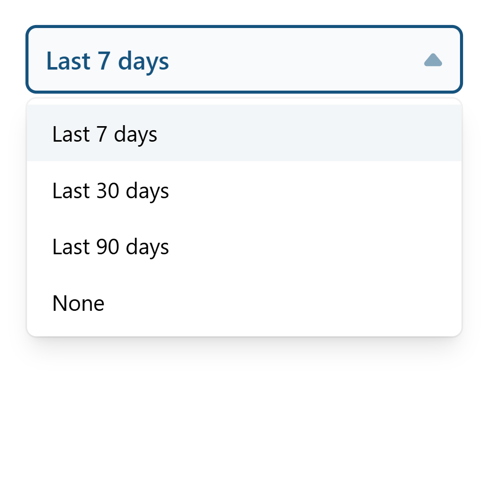
Select
import { Select } from '@/afcl'


const selected = ref(null)
Single
<Select
  class="w-full"
  :options="[
    {label: 'Last 7 days', value: '7'},
    {label: 'Last 30 days', value: '30'},
    {label: 'Last 90 days', value: '90'},
    {label: 'None', value: null}
  ]"
  v-model="selected"
></Select>
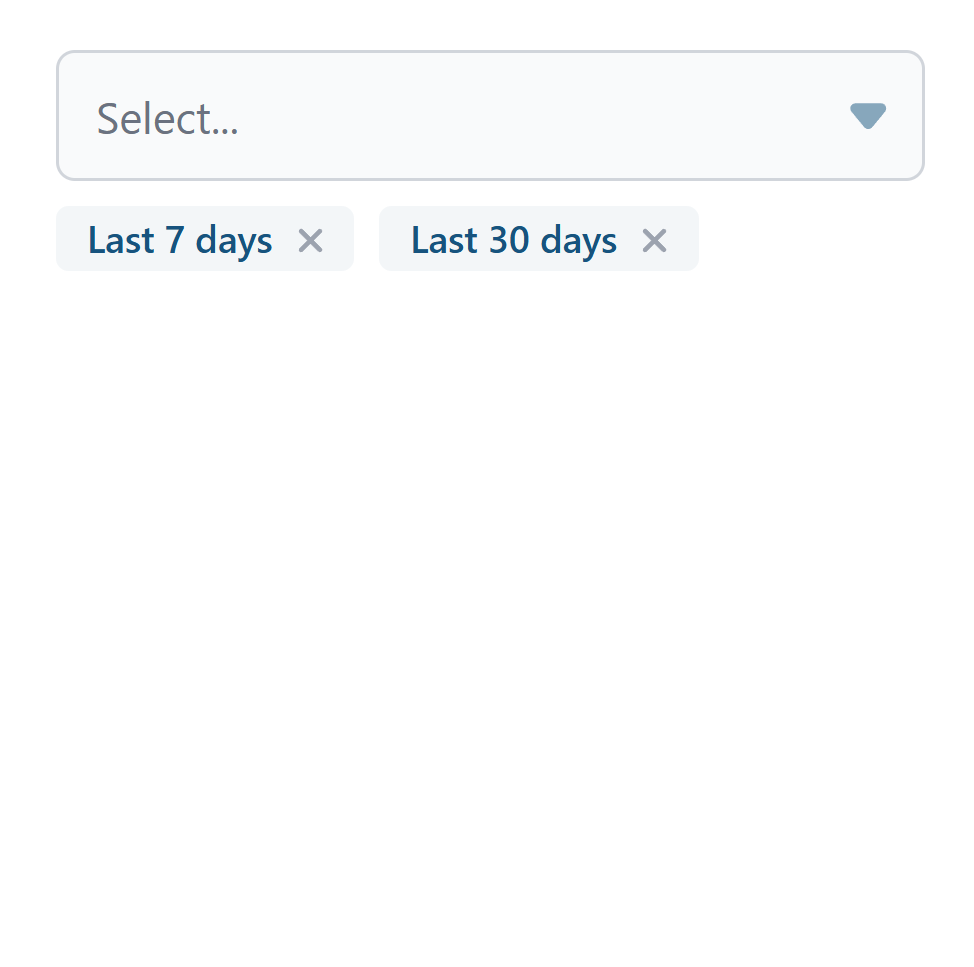
Multiple
const selected = ref(null)
const selected = ref([])
<Select
  class="w-full"
  :options="[
    {label: 'Last 7 days', value: '7'},
    {label: 'Last 30 days', value: '30'},
    {label: 'Last 90 days', value: '90'},
    {label: 'None', value: null}
  ]"
  v-model="selected"
  multiple
></Select>
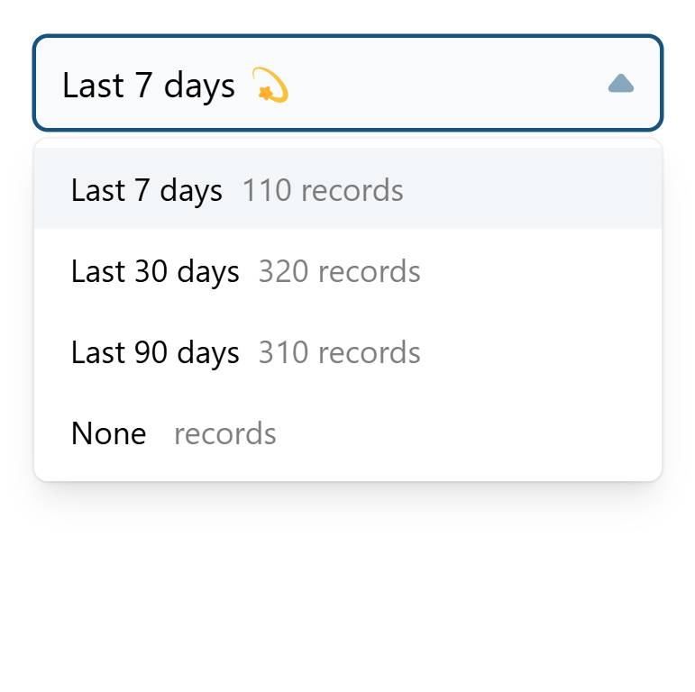
Custom slots for item
You can customize item and selected item using slots.
<Select
  class="w-full"
  :options="[
    {label: 'Last 7 days', value: '7', records: 110},
    {label: 'Last 30 days', value: '30', records: 320},
    {label: 'Last 90 days', value: '90', records: 310},
    {label: 'None', value: null}
  ]"
  v-model="selected"
>
  <template #item="{option}">
    <div>
      <span>{{ option.label }}</span>
      <span class="ml-2 opacity-50">{{ option.records }} records</span>
    </div>
  </template>
  <template #selected-item="{option}">
    <span>{{ option.label }} 💫</span>
  </template>
</Select>
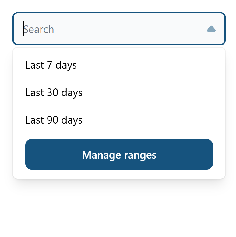
Extra item
You might need to put some extra item at bottom of list
<Select
  class="w-full"
  :options="[
    {label: 'Last 7 days', value: '7'},
    {label: 'Last 30 days', value: '30'},
    {label: 'Last 90 days', value: '90'},
  ]"
  v-model="selected"
>
  <template #extra-item>
    <LinkButton to="/ranges">Manage ranges</LinkButton>
  </template>

</Select>
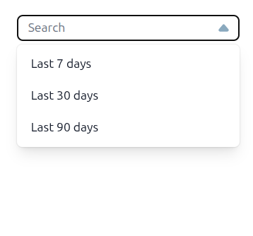
Add classes to the input directly
You might need to put some extra item at bottom of list
<Select
  class="w-full"
  :options="[
    {label: 'Last 7 days', value: '7'},
    {label: 'Last 30 days', value: '30'},
    {label: 'Last 90 days', value: '90'},
  ]"
  v-model="selected"
  classesForInput="py-[4px] text-sm bg-white rounded"
>

</Select>
Input
import { Input } from '@/afcl'
<Input type="number" class="w-full">
  <template #suffix>
    USD
  </template>
</Input>

import { Input } from '@/afcl'
import { IconSearchOutline } from '@iconify-prerendered/vue-flowbite'
<Input type="text" class="w-full">
  <template #rightIcon>
    <IconSearchOutline class="w-5 h-5 text-gray-400"/>
  </template>
</Input>

Textarea
import { Textarea } from '@/afcl'
    <Textarea
      v-model="textAreaInput"
      placeholder="Enter some text..."
      class="w-64"
    />

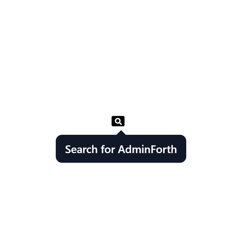
Tooltip
Wrap an element on which you would like to show a tooltip with the Tooltip component and add a tooltip slot to it.
import { Tooltip } from '@/afcl'
<Tooltip>
    <a :href="`https://google.com?q=adminforth`" target="_blank" >
        <IconCardSearch class="w-5 h-5 me-2"/>
    </a>

    <template #tooltip>
        Search for AdminForth
    </template>
</Tooltip>
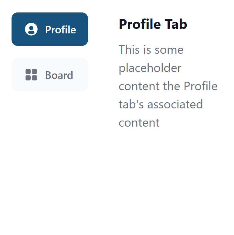
VerticalTabs
Wrap each tab lable in tamplate with v-slot value tab:TAB_ALIAS. Wrap each tab content in tamplate with v-slot value TAB_ALIAS. TAB_ALIAS is a unique identifier for each tab here. Place all templates inside VerticalTabs component.
import { VerticalTabs } from '@/afcl'
import { IconGridSolid, IconUserCircleSolid } from '@iconify-prerendered/vue-flowbite';
<VerticalTabs>
  <template #tab:Profile>
    <IconUserCircleSolid class="w-5 h-5 me-2"/>
    Profile
  </template>
  <template #tab:Dashboard>
    <IconGridSolid class="w-5 h-5 me-2"/>
    Board
  </template>
  <template #Profile>
    <h3 class="text-lg font-bold text-gray-900 dark:text-white mb-2">Profile Tab</h3>
    <p class="mb-2">This is some placeholder content the Profile tab's associated content</p>
  </template>
  <template #Dashboard>
    Dashboard Tab Content
  </template>
</VerticalTabs>
Checkbox
import { Checkbox } from '@/afcl'
const enable = ref(false)
<Checkbox v-model="enable">
  Enable
</Checkbox>

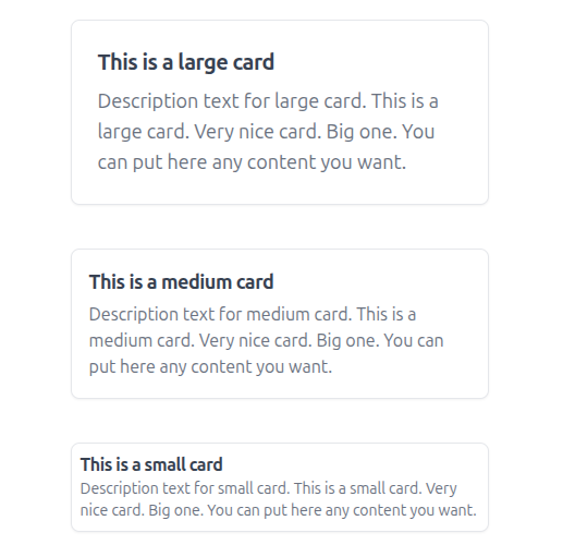
Card
Custom card
If you need custom card, you can make it without
<Card>
  <p class="font-semibold text-gray-600 text-xl dark:text-gray-300">Total Profit</p>
  <p class="text-green-500 font-bold mt-2">$100,000</p>
</Card>

Standart card
import { Card } from '@/afcl'

  ...

  <Card
    title="This is a large card"
    description="Description text for large card. This is a large card. Very nice card. Big one. You can put here any content you want."
  >
  </Card>

  <Card
    size="md"
    title="This is a medium card"
    description="Description text for medium card. This is a medium card. Very nice card. Big one. You can put here any content you want."
  >
  </Card>

  <Card
    size="sm"
    title="This is a small card"
    description="Description text for small card. This is a small card. Very nice card. Big one. You can put here any content you want."
  >
  </Card>
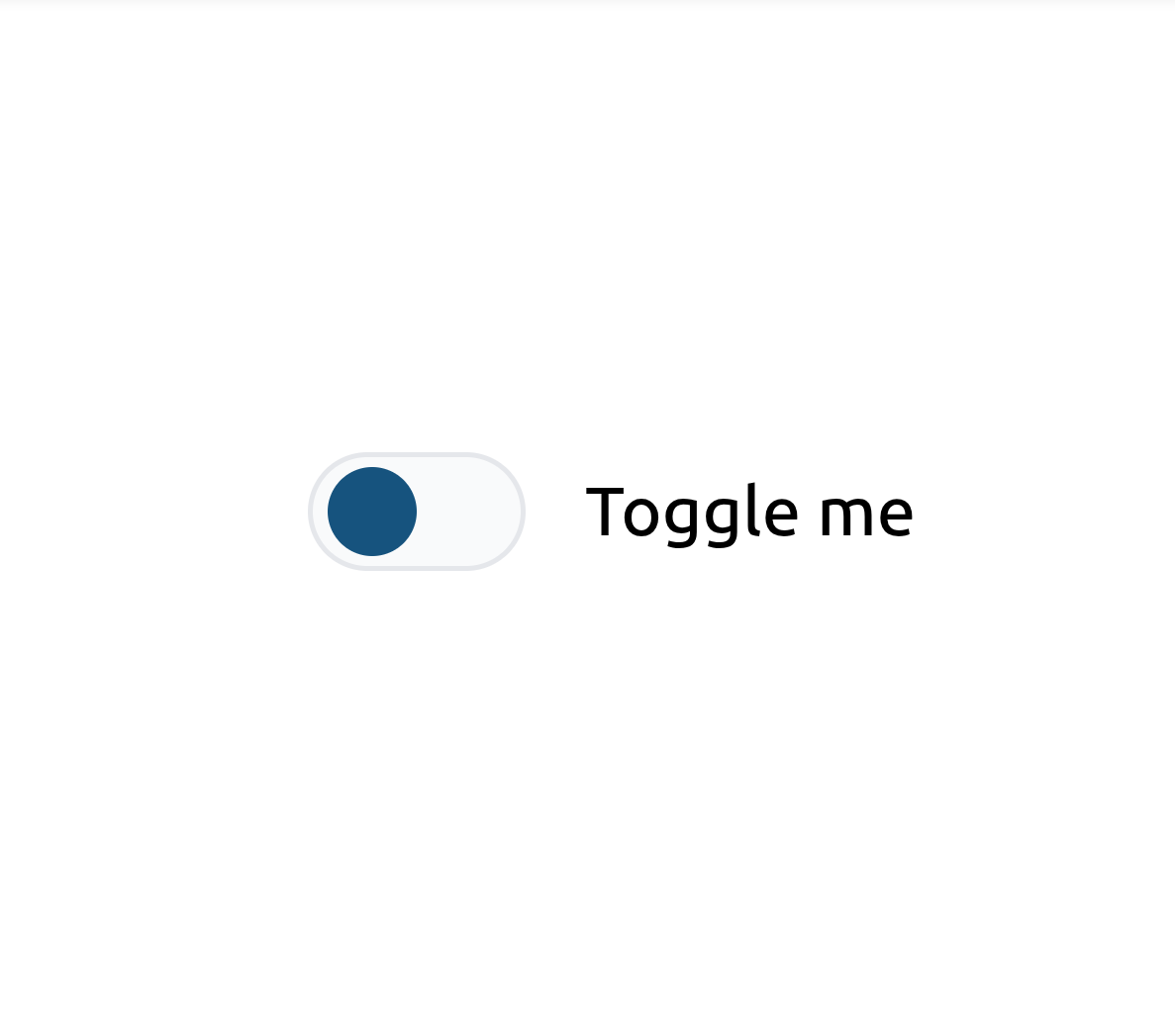
Toggle
import Toggle from '@/afcl/Toggle.vue';
  <Toggle
    :disabled="false"
    @update:modelValue="toggleSwitchHandler">
    <p>Click me</p>
  </Toggle>
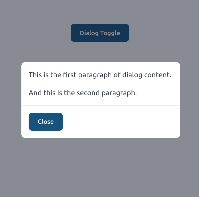
Dialog (Pop-up)
import { Dialog } from '@/afcl';
import { Button } from '@/afcl';
<Dialog class="w-96">
  <template #trigger>
    <Button>Dialog Toggle</Button>
  </template>

  <div class="space-y-4">
    <p>This is the first paragraph of dialog content.</p>
    <p>And this is the second paragraph.</p>
  </div>
</Dialog>
Header
You can add header to the dialog by using header prop.
<Dialog class="w-96">
<Dialog
  class="w-96"
  header="Dialog Header"
>
  <template #trigger>
    <Button>Dialog Toggle</Button>
  </template>

  <div class="space-y-4">
    <p>This is the first paragraph of dialog content.</p>
    <p>And this is the second paragraph.</p>
  </div>
</Dialog>
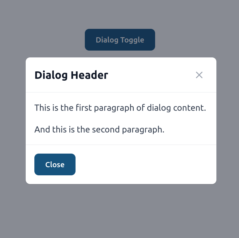
If you want to remove close button in header, you can add :header-close-button="false" prop to <Dialog>.
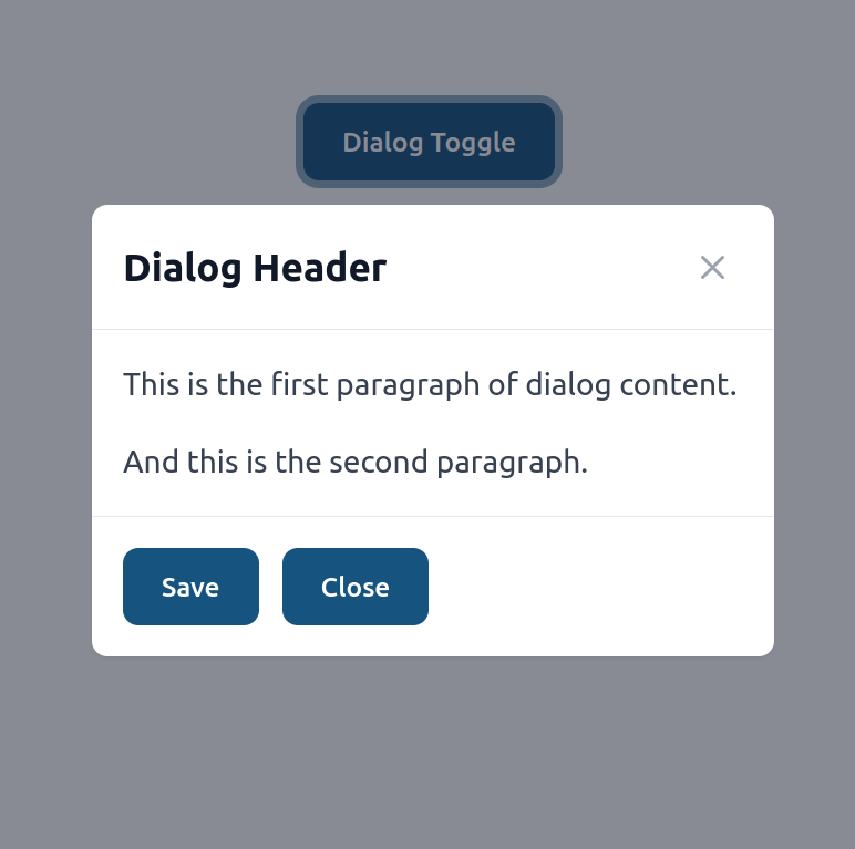
Buttons
By default dialog will have just one "Close" button. If you want to change that, you can set buttons to a desirable array.
<Dialog
  class="w-96"
  header="Dialog Header"
  :buttons="[
    { label: 'Save', onclick: (dialog) => { doSave(); dialog.hide(); } },
    { label: 'Close', onclick: (dialog) => dialog.hide() },
  ]"
>
  <template #trigger>
    <Button>Dialog Toggle</Button>
  </template>

  <div class="space-y-4">
    <p>This is the first paragraph of dialog content.</p>
    <p>And this is the second paragraph.</p>
  </div>
</Dialog>
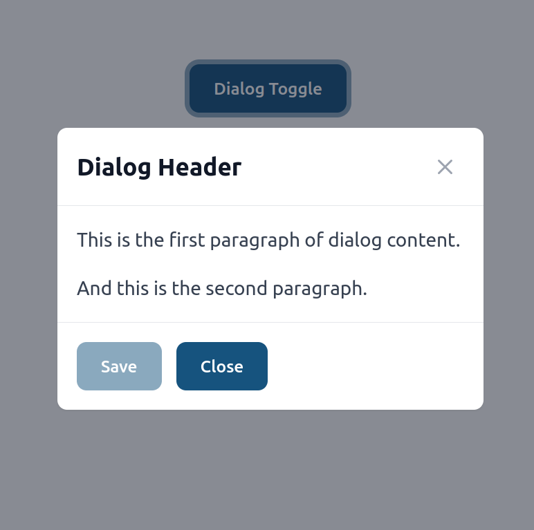
Dialog component will render each button using afcl Button component. You can pass any props to those buttons by adding options field to a button item.
<Dialog
  class="w-96"
  header="Dialog Header"
  :buttons="[
    { label: 'Save', onclick: (dialog) => { doSave(); dialog.hide(); } },
    {
      label: 'Save',
      options: {
        disabled: savingIsAllowed,
      },
      onclick: (dialog) => { doSave(); dialog.hide(); },
    },
    { label: 'Close', onclick: (dialog) => dialog.hide() },
  ]"
>
  <template #trigger>
    <Button>Dialog Toggle</Button>
  </template>

  <div class="space-y-4">
    <p>This is the first paragraph of dialog content.</p>
    <p>And this is the second paragraph.</p>
  </div>
</Dialog>
Dialog persistence
Default behavior of the Dialog component will allow user to close it by just clicking outside. You can prevent that by setting clickToCloseOutside to false.
<Dialog
  class="w-96"
  header="Dialog Header"
  :buttons="[
    {
      label: 'Save',
      options: {
        disabled: savingIsAllowed,
      },
      onclick: (dialog) => { doSave(); dialog.hide(); },
    },
    { label: 'Close', onclick: (dialog) => dialog.hide() },
  ]"
  :click-to-close-outside="false"
>
  <template #trigger>
    <Button>Dialog Toggle</Button>
  </template>

  <div class="space-y-4">
    <p>This is the first paragraph of dialog content.</p>
    <p>And this is the second paragraph.</p>
  </div>
</Dialog>
Programatically open or close dialog
If you want to control dialog programmatically, you can use ref to get a reference to the dialog component.
<Dialog ref="confirmDialog" class="w-96">
  <div class="space-y-4">
    The dialog content goes here.
  </div>
</Dialog>
Now you can open and close dialog by calling open and close methods.
const confirmDialog = ref(null);

const openDialog = () => {
  confirmDialog.value.open();
}

const closeDialog = () => {
  confirmDialog.value.close();
}
Before open/close dialog handlers
If you want to run custom logic before the dialog opens or closes by passing callback props:
<Dialog
  class="w-96"
  :beforeCloseFunction="onBeforeOpen"
  :beforeOpenFunction="onBeforeClose"
>
  <template #trigger>
    <Button>Dialog Toggle</Button>
  </template>

  <div class="space-y-4">
    <p>This is the first paragraph of dialog content.</p>
    <p>And this is the second paragraph.</p>
  </div>
</Dialog>
Now you can pass before open/close functions:
const counter = ref(0);

function onBeforeOpen() {
  counter.value++;
  console.log(`custom open function called ${counter.value}`);
}

function onBeforeClose() {
  counter.value++;
  console.log(`custom close function called ${counter.value}`);
}
Ask for extra confirmation before close
If you want dialog to ask user for conformation when he tryes to close dialog, you can add:
<Dialog
  ref="confirmDialog"
  class="w-96"
  :closable="false"
  :askForCloseConfirmation="true"
  closeConfirmationText='Are you sure you want to close this dialog?',
>
  <div class="space-y-4">
    The dialog content goes here.
  </div>
</Dialog>
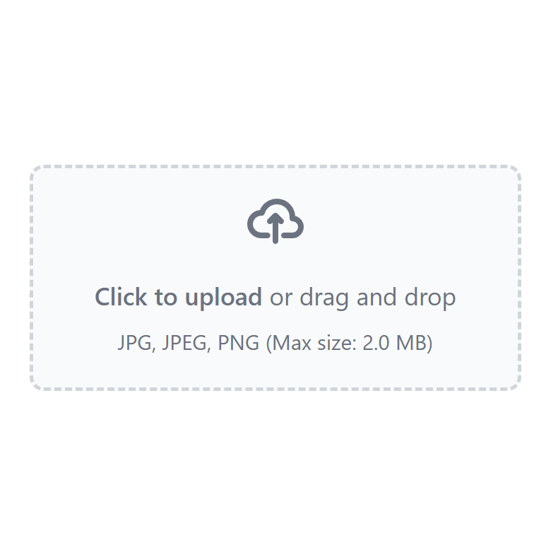
Dropzone
import { Ref } from 'vue'
import { Dropzone } from '@/afcl'

const files: Ref<File[]> = ref([])

watch(files, (files) => {
  console.log('files selected', files);
  setTimeout(() => {
    // clear
    files.length = 0;
  }, 5000);
})
<Dropzone
  :extensions="['.jpg', '.jpeg', '.png']"
  :maxSizeBytes="1024 * 1024 * 2"
  :multiple="false"
  v-model="files"
/>
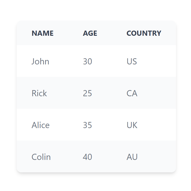
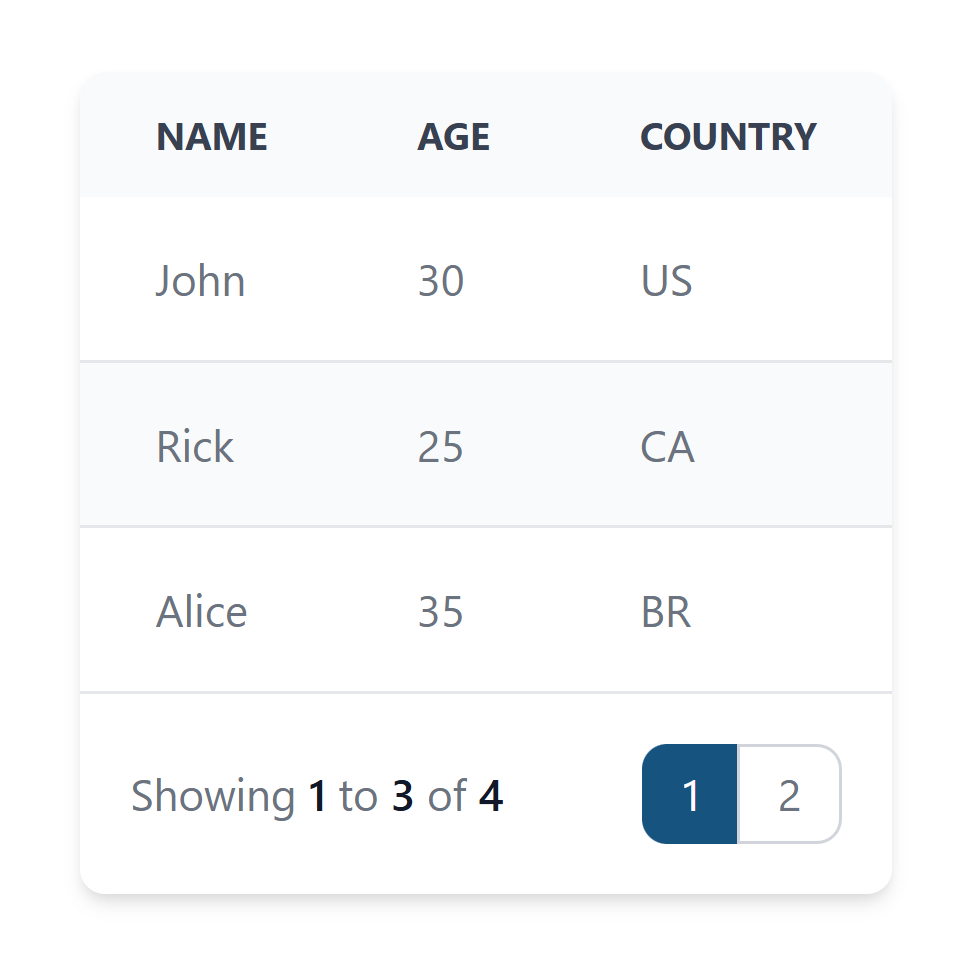
Table
import { Table } from '@/afcl'
<Table
  :columns="[
    { label: 'Name', fieldName: 'name' },
    { label: 'Age', fieldName: 'age' },
    { label: 'Country', fieldName: 'country' },
  ]"
  :data="[
    { name: 'John', age: 30, country: 'US' },
    { name: 'Rick', age: 25, country: 'CA' },
    { name: 'Alice', age: 35, country: 'UK' },
    { name: 'Colin', age: 40, country: 'AU' },
  ]"
></Table>
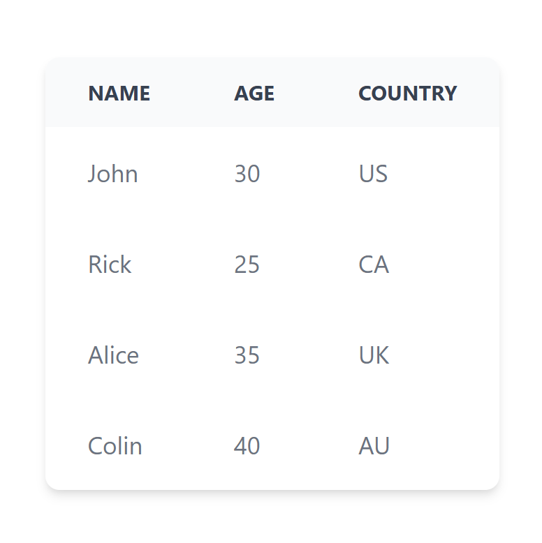
No even highlights
<Table
  :columns="[
    { label: 'Name', fieldName: 'name' },
    { label: 'Age', fieldName: 'age' },
    { label: 'Country', fieldName: 'country' },
  ]"
  :data="[
    { name: 'John', age: 30, country: 'US' },
    { name: 'Rick', age: 25, country: 'CA' },
    { name: 'Alice', age: 35, country: 'UK' },
    { name: 'Colin', age: 40, country: 'AU' },
  ]"
  :evenHighlights="false"
></Table>
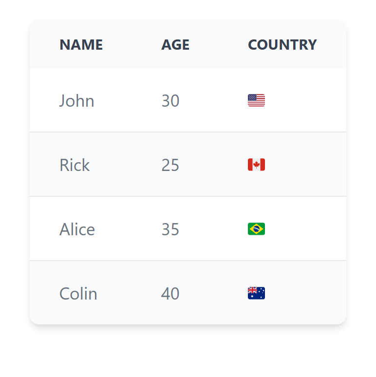
Custom cell
import { Table } from '@/afcl'
const isoFlagToEmoji = (iso) => iso.toUpperCase().replace(/./g, char => String.fromCodePoint(char.charCodeAt(0) + 127397))
<Table
  :columns="[
    { label: 'Name', fieldName: 'name' },
    { label: 'Age', fieldName: 'age' },
    { label: 'Country', fieldName: 'country' },
  ]"
  :data="[
    { name: 'John', age: 30, country: 'US' },
    { name: 'Rick', age: 25, country: 'CA' },
    { name: 'Alice', age: 35, country: 'BR' },
    { name: 'Colin', age: 40, country: 'AU' },
  ]"
>
  <template #cell:country="{item}">
    {{ isoFlagToEmoji(item.country) }}
  </template>
</Table>
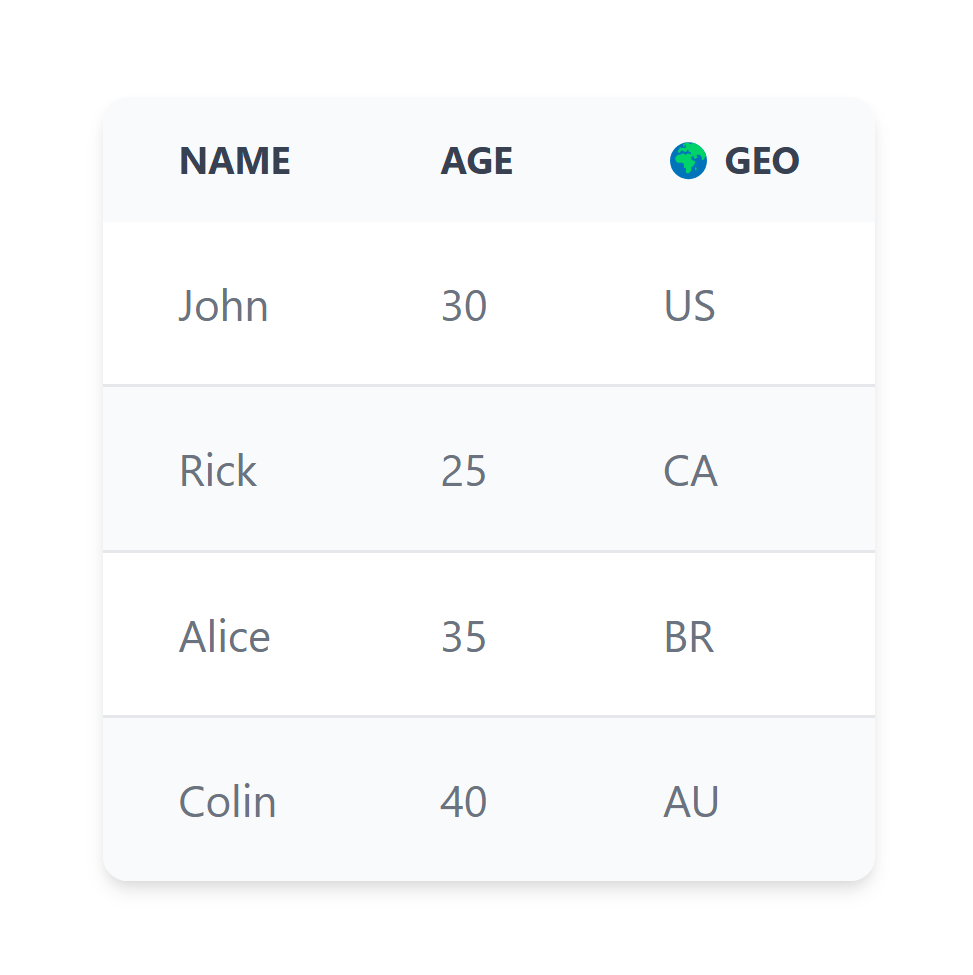
Custom header
        <Table
  :columns="[
    { label: 'Name', fieldName: 'name' },
    { label: 'Age', fieldName: 'age' },
    { label: 'Country', fieldName: 'country' },
  ]"
  :data="[
    { name: 'John', age: 30, country: 'US' },
    { name: 'Rick', age: 25, country: 'CA' },
    { name: 'Alice', age: 35, country: 'BR' },
    { name: 'Colin', age: 40, country: 'AU' },
  ]"
>
<template #header:country>
    🌍 Geo
</template>
</Table>
Pagination
Table provides front-end side pagination. You can set pageSize (default is 10) to set how many rows to show per page.
If there is less then pageSize rows, pagination will not be shown.
<Table
  :columns="[
    { label: 'Name', fieldName: 'name' },
    { label: 'Age', fieldName: 'age' },
    { label: 'Country', fieldName: 'country' },
  ]"
  :data="[
    { name: 'John', age: 30, country: 'US' },
    { name: 'Rick', age: 25, country: 'CA' },
    { name: 'Alice', age: 35, country: 'BR' },
    { name: 'Colin', age: 40, country: 'AU' },
  ]"
  :pageSize="3"
>
</Table>
Server-side pagination
To load pages dynamically, simply pass async callback to data:
async function loadPageData(data) {
  const { offset, limit } = data;
  // in real app do await callAdminForthApi or await fetch to get date, use offset and limit value to slice data
  return {
    data: [
      { name: 'John', age: offset, country: 'US' },
      { name: 'Rick', age: offset+1, country: 'CA' },
      { name: 'Alice', age: offset+2, country: 'BR' },
    ],
    total: 3 // should return total amount of records in database
  }
}

<Table
  :columns="[
    { label: 'Name', fieldName: 'name' },
    { label: 'Age', fieldName: 'age' },
    { label: 'Country', fieldName: 'country' },
  ]"
  :data="[...]
  :data="loadPageData"

  :pageSize="3">
</Table>
👆 The page size is used as the limit for pagination.
Sorting
Table supports column sorting out of the box.
- By default, columns are NOT sortable. Enable sorting per column with
sortable: true. - Clicking a sortable header cycles sorting in a tri-state order:
- none → ascending → descending → none
- When it returns to "none", the sorting is cleared.
Basic example (client-side sorting when data is an array):
<Table
  :columns="[
    { label: 'Name', fieldName: 'name', sortable: true },
    { label: 'Age', fieldName: 'age', sortable: true },
    // disable sort for a specific column
    { label: 'Country', fieldName: 'country', sortable: false },
  ]"
  :data="[
    { name: 'John', age: 30, country: 'US' },
    { name: 'Rick', age: 25, country: 'CA' },
    { name: 'Alice', age: 35, country: 'BR' },
    { name: 'Colin', age: 40, country: 'AU' },
  ]"
  :pageSize="3"
/>
You can also predefine a default sort:
<Table
  :columns="[
    { label: 'Name', fieldName: 'name', sortable: true },
    { label: 'Age', fieldName: 'age', sortable: true },
    { label: 'Country', fieldName: 'country' },
  ]"
  :data="rows"
  defaultSortField="age"
  defaultSortDirection="desc"
/>
Notes:
- Client-side sorting supports nested field paths using dot-notation, e.g.
user.name. - When a column is not currently sorted, a subtle double-arrow icon is shown; arrows switch up/down for ascending/descending.
Nested field path sorting
You can sort by nested properties of objects in rows using dot-notation in fieldName.
Example:
<Table
  :columns="[
    { label: 'User Name', fieldName: 'user.name', sortable: true },
    { label: 'User Email', fieldName: 'user.email', sortable: true },
    { label: 'City', fieldName: 'user.address.city', sortable: true },
    { label: 'Country', fieldName: 'user.address.country' },
  ]"
  :data="[
    { user: { name: 'Alice', email: 'alice@example.com', address: { city: 'Berlin', country: 'DE' } } },
    { user: { name: 'Bob', email: 'bob@example.com', address: { city: 'Paris', country: 'FR' } } },
    { user: { name: 'Carlos', email: 'carlos@example.com', address: { city: 'Madrid', country: 'ES' } } },
    { user: { name: 'Dana', email: 'dana@example.com', address: { city: 'Rome', country: 'IT' } } },
    { user: { name: 'Eve', email: 'eve@example.com', address: { city: null, country: 'US' } } },
  ]"
  :pageSize="3"
/>
Behavior details:
- The path is split on dots and resolved step by step:
user.address.city. - Missing or
nullnested values are pushed to the bottom for ascending order (and top for descending) becausenull/undefinedare treated as greater than defined values in asc ordering. - Works the same for client-side sorting and for server-side loaders: when using an async loader the same
sortField(e.g.user.address.city) is passed so you can implement equivalent ordering on the backend. - Date objects at nested paths are detected and compared chronologically.
- Numeric comparison is stable for mixed numeric strings via Intl.Collator with numeric option.
Edge cases to consider in your own data:
- Deeply missing branches like
user.profile.settings.localesimply result inundefinedand will follow the null ordering logic above. - Arrays are not traversed; if you need array-specific sorting you should pre-normalize data into scalar fields before passing to the table.
Server-side sorting
When you provide an async function to data, the table will pass the current sort along with pagination params.
Signature of the loader receives:
type LoaderArgs = {
  offset: number;
  limit: number;
  sortField?: string; // undefined when unsorted
  sortDirection?: 'asc' | 'desc'; // only when sortField is set
}
Example using fetch:
async function loadPageData({ offset, limit, sortField, sortDirection }) {
  const url = new URL('/api/products', window.location.origin);
  url.searchParams.set('offset', String(offset));
  url.searchParams.set('limit', String(limit));
  if (sortField) url.searchParams.set('sortField', sortField);
  if (sortField && sortDirection) url.searchParams.set('sortDirection', sortDirection);

  const { data, total } = callAdminForthApi('getProducts', {limit, offset, sortField, sortDirection});
  return { data, total };
}

<Table
  :columns="[
    { label: 'ID', fieldName: 'id' },
    { label: 'Title', fieldName: 'title' },
    { label: 'Price', fieldName: 'price' },
  ]"
  :data="loadPageData"
  :pageSize="10"
/>
Events you can listen to:
<Table
  :columns="columns"
  :data="loadPageData"
  @update:sortField="(f) => currentSortField = f"
  @update:sortDirection="(d) => currentSortDirection = d"
  @sort-change="({ field, direction }) => console.log('sort changed', field, direction)"
/>
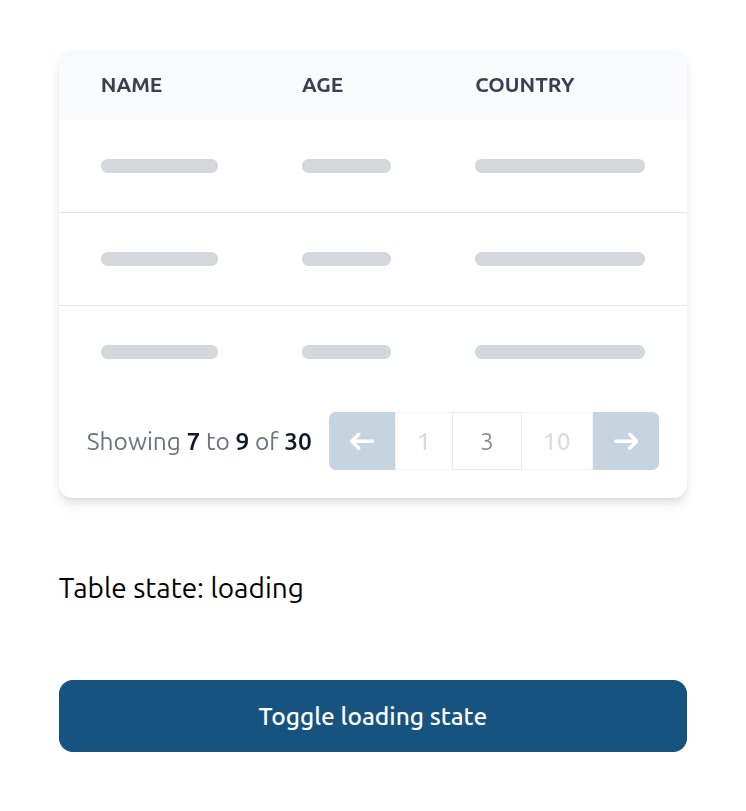
Table loading states
For tables where you load data externally and pass them to data prop as array (including case with front-end pagination) you might want to show skeleton loaders in table externaly using isLoading props.
For tables with server-side paganation which use async function in data prop you can listen for @update:tableLoading to get table internal loading state, in other words this event will let you know when server side function started and finished execution, so you might use it e.g. to disable some external filter buttons and so on.
import { Table, Button } from "@/afcl"
const isTableLoading = ref(false);
const tableState = ref("loading");

  ...

  <Table
    :columns="[
      { label: 'Name', fieldName: 'name' },
      { label: 'Age', fieldName: 'age' },
      { label: 'Country', fieldName: 'country' },
    ]"
    :data="loadPageData"
    :isLoading="isTableLoading"
    :pageSize="3"
    @update:tableLoading="(loading) => loading === true ? tableState = 'loading' : tableState = 'loaded'"
  >
  </Table>

  <p> Table state: {{ tableState }} </p>

  <Button @click="isTableLoading.value=!isTableLoading.value"> Toggle loading state</Button>
Making header and pagination sticky
If you want to make table header or pagination, you can add makeHeaderSticky, makePaginationSticky
  <Table
    class="min-h-[200px] max-h-[250px]"
    makeHeaderSticky
    makePaginationSticky
    :columns="[
      { label: 'Name', fieldName: 'name' },
      { label: 'Age', fieldName: 'age' },
      { label: 'Country', fieldName: 'country' },
    ]"
    :data="[
      { name: 'John', age: 30, country: 'US' },
      { name: 'Rick', age: 25, country: 'CA' },
      { name: 'Alice', age: 35, country: 'UK' },
      { name: 'Colin', age: 40, country: 'AU' },
    ]"
  ></Table>
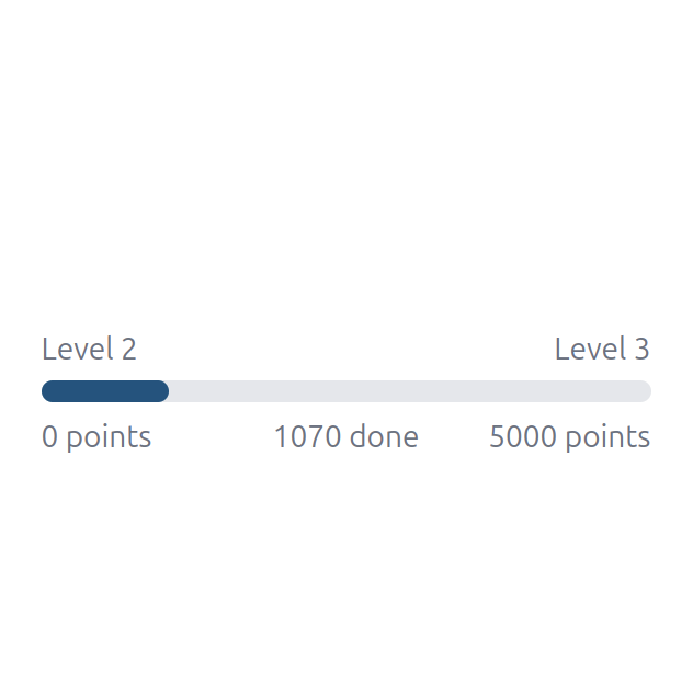
ProgressBar
 <ProgressBar
  :currentValue="2600"
  :minValue="0"
  :maxValue="5000"
  />

Custom labels
Custom labels in the ProgressBar component allow you to customize the text displayed on the left and right sides of the progress bar. You can also customize the format of the value and the progress text.
<ProgressBar
  :currentValue="1070"
  :minValue="0"
  :maxValue="5000"
  :leftLabel="'Level 2'"
  :rightLabel="'Level 3'"
  :formatter="(value: number) => `${value} points`"
  :progressFormatter="(value: number, percentage: number) => `${value} done`"
/>
Show progress animation
 <ProgressBar
  :currentValue="2600"
  :minValue="0"
  :maxValue="5000"
  showAnimation
  />

Change height of the progress bar
 <ProgressBar
  :currentValue="2600"
  :minValue="0"
  :maxValue="5000"
  height='6'
  />

Skeleton
Skeleton component is used to display a loading state for a component. You can use prop type to set the type of the skeleton.
  <div class="flex flex-col gap-2">
    <Skeleton class="w-full h-4" />
    <Skeleton class="w-full h-2" />
    <Skeleton class="w-full h-2" />
    <Skeleton class="w-full h-2" />
    <Skeleton class="w-full h-2" />
  </div>

Skeleton image
<Skeleton type="image" class="w-full h-full" />

Skeleton video
<Skeleton type="video" class="w-full h-full" />

Skeleton avatar
<Skeleton type="avatar" class="w-20 h-20" />

Spinner
Spinner component is used to display a loading state for a component.
<Spinner class="w-10 h-10" />

Country Flag
The Country Flag component displays national flags using ISO 3166-1 alpha-2 country codes.
<CountryFlag countryCode="ua" />

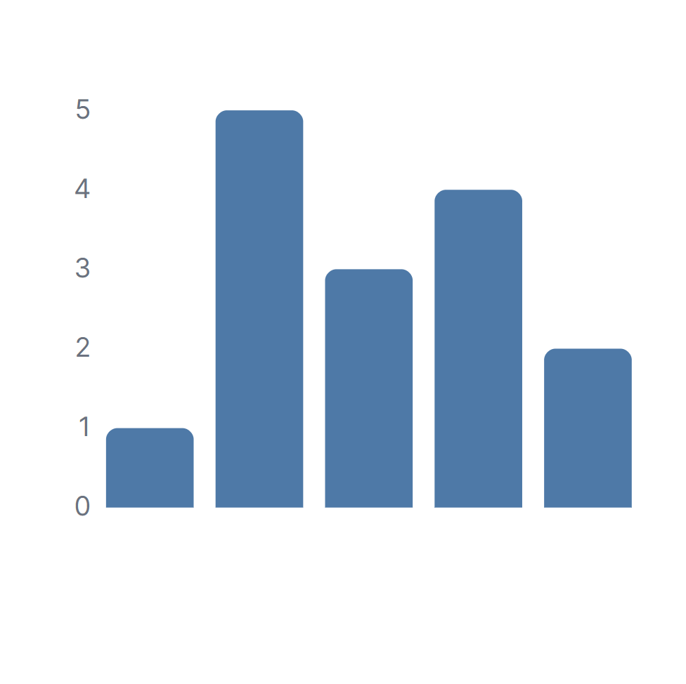
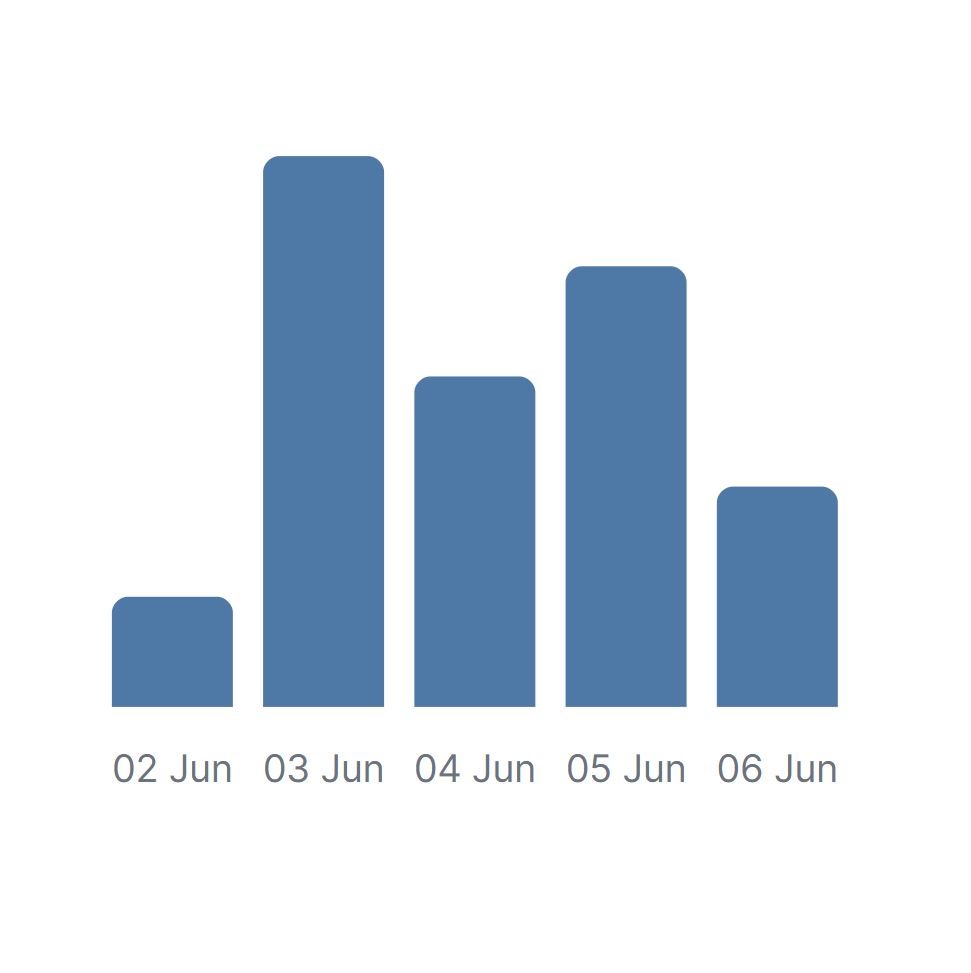
Bar Chart
Under the hood AdminForth uses MIT-licensed ApexCharts. It has very rich variety of options, you can pass
any of native settings to options prop. Here we will only show some basics.
<BarChart
  :data="[
    { count: 1, x: '02 Jun 2025'},
    { count: 5, x: '03 Jun 2025'},
    { count: 3, x: '04 Jun 2025'},
    { count: 4, x: '05 Jun 2025'},
    { count: 2, x: '06 Jun 2025'},
  ]"
  :series="[{
    name: $t('Added apartments'),
    fieldName: 'count',
    color: '#4E79A7',
  }]"
  :options="{
    chart: {
      height: 250,
    },
  }"
/>

Y-axis labels
<BarChart
  :data="[
    { count: 1, x: '02 Jun 2025'},
    { count: 5, x: '03 Jun 2025'},
    { count: 3, x: '04 Jun 2025'},
    { count: 4, x: '05 Jun 2025'},
    { count: 2, x: '06 Jun 2025'},
  ]"
  :series="[{
    name: $t('Added apartments'),
    fieldName: 'count',
    color: '#4E79A7',
  }]"
  :options="{
    chart: {
      height: 250,
    },
    yaxis: {
      stepSize: 1, // needed if your data is integer
      labels: {
        show: true,
        style: {
          fontFamily: 'Inter, sans-serif',
          cssClass: 'text-xs font-normal fill-gray-500 dark:fill-gray-400'
        }
      }
    }
  }"
/>
X-axis labels and formatting labels
<BarChart
  :data="[
    { count: 1, x: '02 Jun 2025'},
    { count: 5, x: '03 Jun 2025'},
    { count: 3, x: '04 Jun 2025'},
    { count: 4, x: '05 Jun 2025'},
    { count: 2, x: '06 Jun 2025'},
  ]"
  :series="[{
    name: $t('Added apartments'),
    fieldName: 'count',
    color: '#4E79A7',
  }]"
  :options="{
    chart: {
      height: 250,
    },
    xaxis: {
      labels: {
        show: true,
        formatter: function (value) {
          return dayjs(value).format('DD MMM');
        },
        style: {
          fontFamily: 'Inter, sans-serif',
          cssClass: 'text-xs font-normal fill-gray-500 dark:fill-gray-400'
        }
      }
    }
  }"
/>
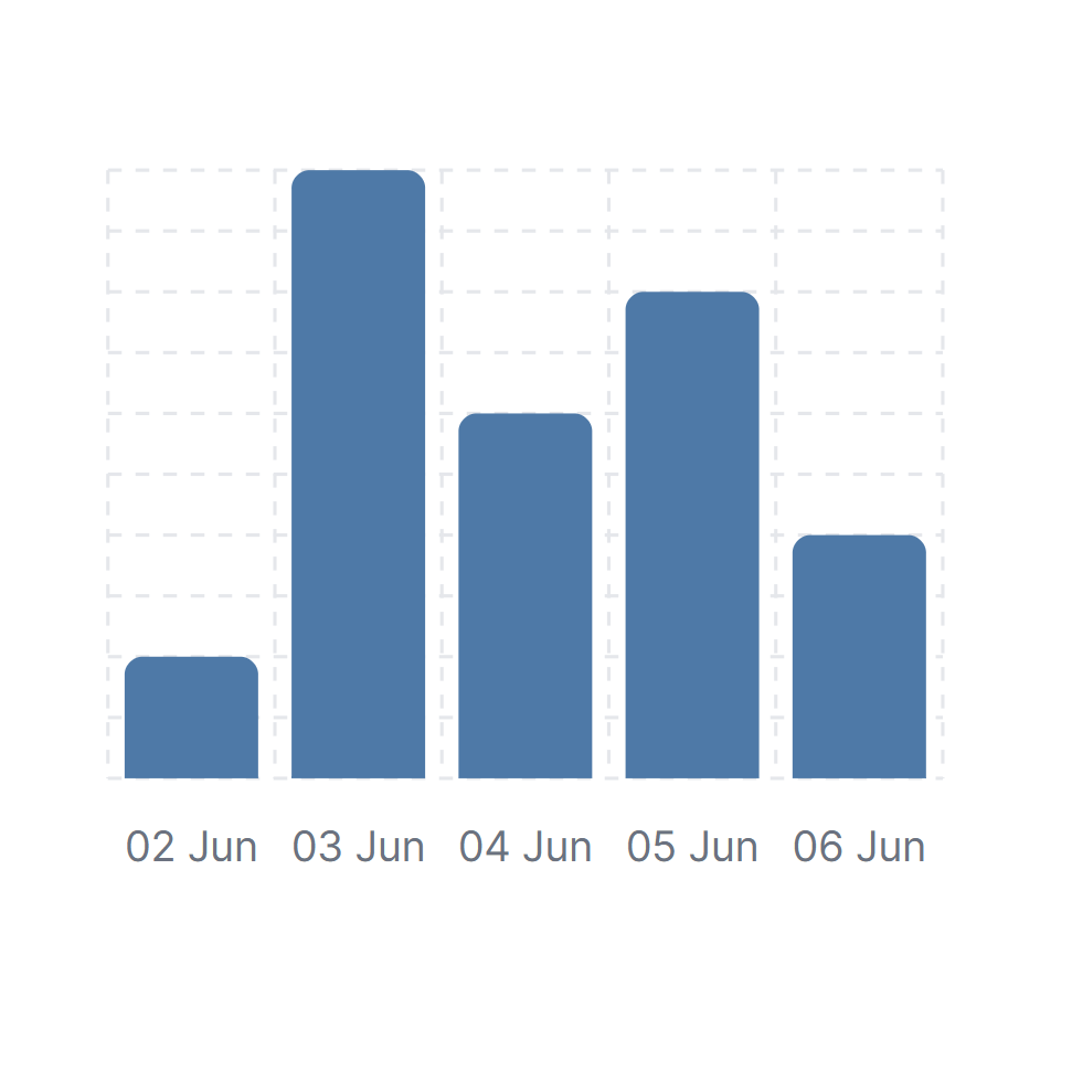
Grid
<BarChart
  :data="[
    { count: 1, x: '02 Jun 2025'},
    { count: 5, x: '03 Jun 2025'},
    { count: 3, x: '04 Jun 2025'},
    { count: 4, x: '05 Jun 2025'},
    { count: 2, x: '06 Jun 2025'},
  ]"
  :series="[{
    name: $t('Added apartments'),
    fieldName: 'count',
    color: '#4E79A7',
  }]"
  :options="{
    chart: {
      height: 250,
    },
    grid: {
      show: true,
      borderColor: 'rgba(0, 0, 0, 0.1)',
      strokeDashArray: 4,
      position: 'back',
      xaxis: {
        lines: {
          show: true
        }
      },
      yaxis: {
        lines: {
          show: true
        }
      }
    }
  }"
/>
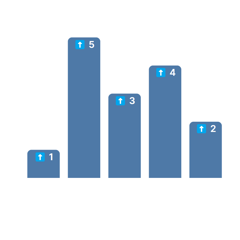
Data labels
<BarChart
  :data="[
    { count: 1, x: '02 Jun 2025'},
    { count: 5, x: '03 Jun 2025'},
    { count: 3, x: '04 Jun 2025'},
    { count: 4, x: '05 Jun 2025'},
    { count: 2, x: '06 Jun 2025'},
  ]"
  :series="[{
    name: $t('Added apartments'),
    fieldName: 'count',
    color: '#4E79A7',
  }]"
  :options="{
    chart: {
      height: 250,
    },
    dataLabels: {
      formatter: function (value) {
        return `⬆️ ${value}`;
      },
      enabled: true,
      style: {
        fontSize: '12px',
        fontFamily: 'Inter, sans-serif',
      }
    }
  }"
/>
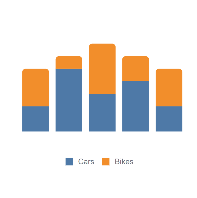
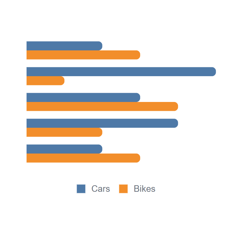
Stacked bars and legend
<BarChart
  :data="[
    { countCars: 2, countBikes: 3, x: '02 Jun 2025'},
    { countCars: 5, countBikes: 1, x: '03 Jun 2025'},
    { countCars: 3, countBikes: 4, x: '04 Jun 2025'},
    { countCars: 4, countBikes: 2, x: '05 Jun 2025'},
    { countCars: 2, countBikes: 3, x: '06 Jun 2025'},
  ]"
  :series="[
    {
      name: $t('Cars'),
      fieldName: 'countCars',
      color: '#4E79A7',
    },
    {
      name: $t('Bikes'),
      fieldName: 'countBikes',
      color: '#F28E2B',
    }
  ]"
  :options="{
    chart: {
      height: 250,
      stacked: true,
    },
    legend: {
      show: true,
    },
  }"
/>
Horizontal bars
<BarChart
  :data="[
    { countCars: 2, countBikes: 3, x: '02 Jun 2025'},
    { countCars: 5, countBikes: 1, x: '03 Jun 2025'},
    { countCars: 3, countBikes: 4, x: '04 Jun 2025'},
    { countCars: 4, countBikes: 2, x: '05 Jun 2025'},
    { countCars: 2, countBikes: 3, x: '06 Jun 2025'},
  ]"
  :series="[
    {
      name: $t('Cars'),
      fieldName: 'countCars',
      color: '#4E79A7',
    },
    {
      name: $t('Bikes'),
      fieldName: 'countBikes',
      color: '#F28E2B',
    }
  ]"
  :options="{
    chart: {
      height: 250,
      type: 'bar',
    },
    plotOptions: {
      bar: {
        horizontal: true,
      }
    },
    legend: {
      show: true,
    },
  }"
/>
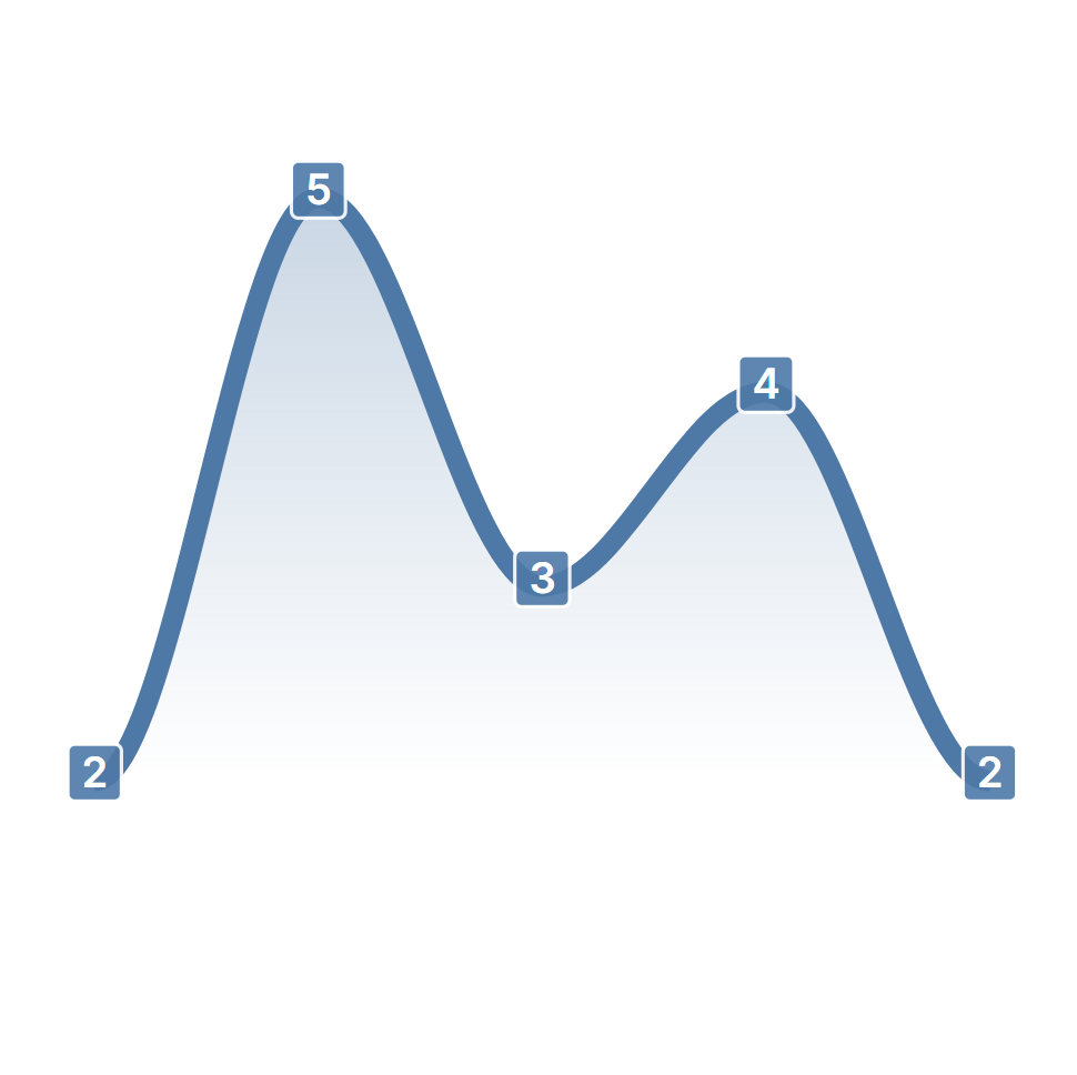
Area Chart
import { AreaChart } from '@/afcl'
<AreaChart
:data="[
{ count: 1, x: '02 Jun 2025'},
{ count: 5, x: '03 Jun 2025'},
{ count: 3, x: '04 Jun 2025'},
{ count: 4, x: '05 Jun 2025'},
{ count: 2, x: '06 Jun 2025'},
]"
:series="[{
name: $t('Added apartments'),
fieldName: 'count',
color: '#4E79A7',
}]"
:options="{
chart: {
height: 250,
},
}"
/>
</div>
<div>

</div>
</div>
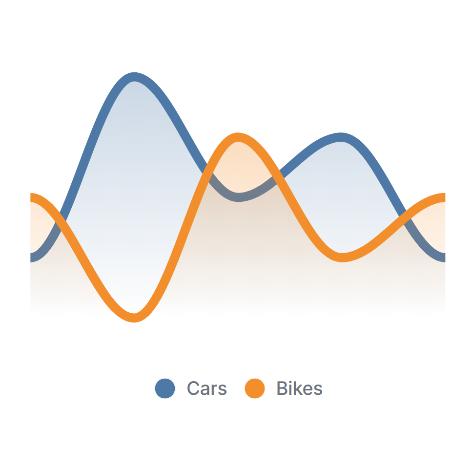
### Multiple lines
<div class="split-screen" >
<div >
```html
<AreaChart
:data="[
{ countCars: 2, countBikes: 3, x: '02 Jun 2025'},
{ countCars: 5, countBikes: 1, x: '03 Jun 2025'},
{ countCars: 3, countBikes: 4, x: '04 Jun 2025'},
{ countCars: 4, countBikes: 2, x: '05 Jun 2025'},
{ countCars: 2, countBikes: 3, x: '06 Jun 2025'},
]"
:series="[
{
name: $t('Cars'),
fieldName: 'countCars',
color: '#4E79A7',
},
{
name: $t('Bikes'),
fieldName: 'countBikes',
color: '#F28E2B',
}
]"
:options="{
chart: {
height: 250,
},
}"
/>
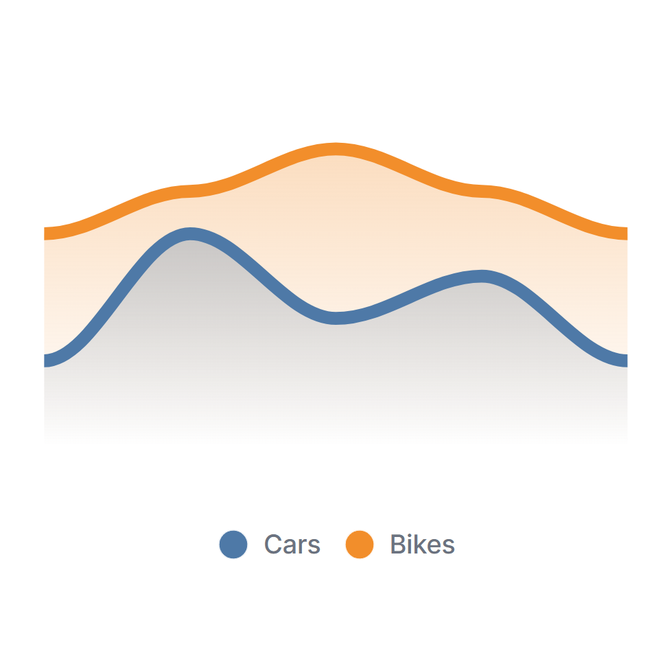
Stacked area
<AreaChart
  :data="[
    { countCars: 2, countBikes: 3, x: '02 Jun 2025'},
    { countCars: 5, countBikes: 1, x: '03 Jun 2025'},
    { countCars: 3, countBikes: 4, x: '04 Jun 2025'},
    { countCars: 4, countBikes: 2, x: '05 Jun 2025'},
    { countCars: 2, countBikes: 3, x: '06 Jun 2025'},
  ]"
  :series="[
    {
      name: $t('Cars'),
      fieldName: 'countCars',
      color: '#4E79A7',
    },
    {
      name: $t('Bikes'),
      fieldName: 'countBikes',
      color: '#F28E2B',
    }
  ]"
  :options="{
    chart: {
      height: 250,
      stacked: true,
    },
  }"
/>
Data labels
<AreaChart
  :data="[
    { count: 2, x: '02 Jun 2025'},
    { count: 5, x: '03 Jun 2025'},
    { count: 3, x: '04 Jun 2025'},
    { count: 4, x: '05 Jun 2025'},
    { count: 2, x: '06 Jun 2025'},
  ]"
  :series="[
    {
      name: $t('Cars'),
      fieldName: 'count',
      color: '#4E79A7',
    },
  ]"
  :options="{
    chart: {
      height: 250,
    },
    dataLabels: {
      enabled: true,
      style: {
        fontSize: '12px',
        fontFamily: 'Inter, sans-serif',
      }
    },
    grid: {
      padding: {
        left: 10, // to fit the labels
        right: 10,
      },
    },
  }"
/>
Grid, x-axis and y-axis labels
See Bar Chart for details, the config is the same.
Pie Chart
import { PieChart } from '@/afcl'
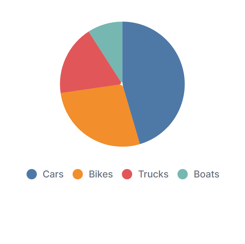
Basic
<PieChart
  :data="[
    { amount: 5, label: 'Cars'},
    { amount: 3, label: 'Bikes'},
    { amount: 2, label: 'Trucks'},
    { amount: 1, label: 'Boats'},
  ]"
  :options="{
    chart: {
      height: 250,
    },
  }"
/>
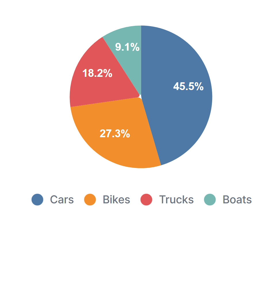
Pie with data labels
<PieChart
  :data="[
    { amount: 5, label: 'Cars'},
    { amount: 3, label: 'Bikes'},
    { amount: 2, label: 'Trucks'},
    { amount: 1, label: 'Boats'},
  ]"
  :options="{
    chart: {
      height: 250,
    },
    dataLabels: {
      enabled: true,
    },
    plotOptions: {
      pie: {
        dataLabels: {
          offset: -10, // Moves labels closer to or further from the slices
          minAngleToShowLabel: 10, // Ensures that small slices don't show labels
        },
        expandOnClick: true,
      },
    },
  }"
/>
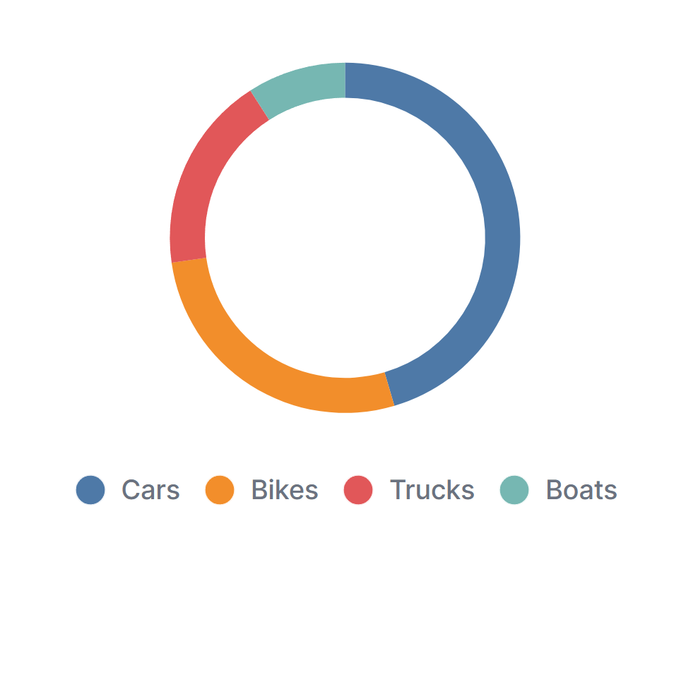
Donut Chart
<PieChart
  :data="[
    { amount: 5, label: 'Cars'},
    { amount: 3, label: 'Bikes'},
    { amount: 2, label: 'Trucks'},
    { amount: 1, label: 'Boats'},
  ]"
  :options="{
    chart: {
      height: 250,
      type: 'donut',
    },
  }"
/>
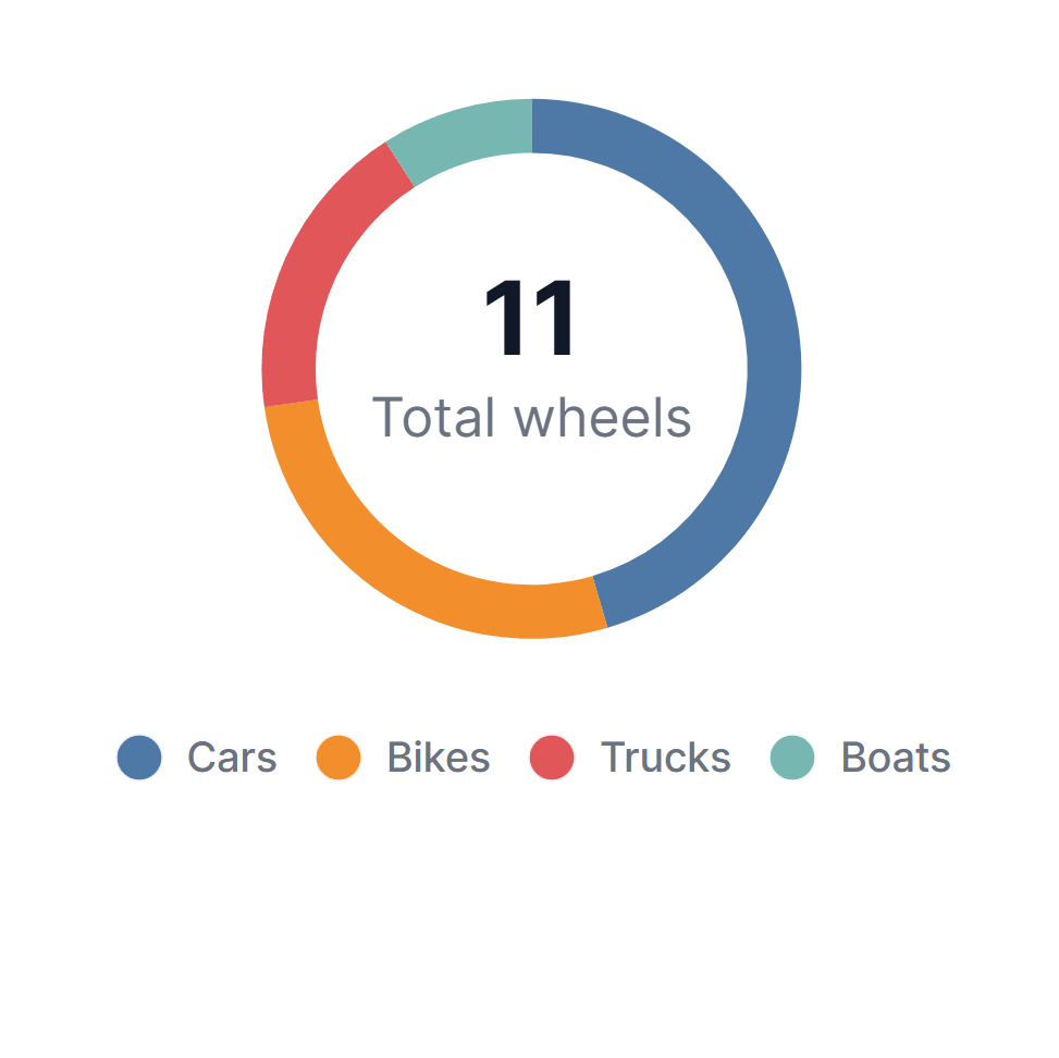
Fill donut with total info
<PieChart
  :data="[
    { amount: 5, label: 'Cars'},
    { amount: 3, label: 'Bikes'},
    { amount: 2, label: 'Trucks'},
    { amount: 1, label: 'Boats'},
  ]"
  :options="{
    chart: {
      height: 250,
      type: 'donut',
    },
    plotOptions: {
      pie: {
        donut: {
          labels: {
            total: {
              show: true,
              label: $t('Total wheels'),
              formatter: () => `11`,
            },
          },
        },
      },
    },
  }"
/>
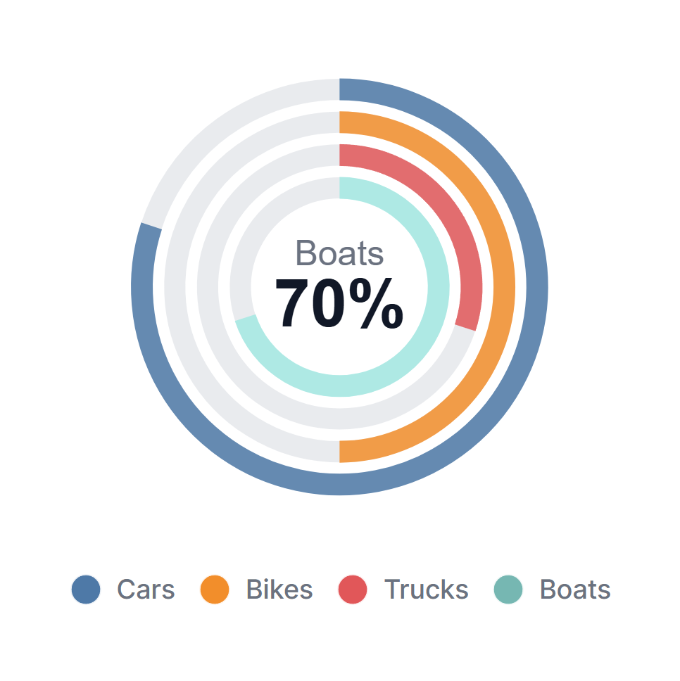
Radial bar chart
  <PieChart
  :data="[
    { amount: 80, label: 'Cars'},
    { amount: 50, label: 'Bikes'},
    { amount: 30, label: 'Trucks'},
    { amount: 70, label: 'Boats'},
  ]"
  :options="{
    chart: {
      height: '300px',
      width: '100%',
      type: 'radialBar',
      sparkline: {
        enabled: true,
      },
    },
    plotOptions: {
      radialBar: {
        track: {
          background: '#E5E7EB',
        },
        dataLabels: {
          name: {
            offsetY: -10
          },
          value: {
            offsetY: 2,
          }
        },
        hollow: {
          margin: 0,
          size: '32%',
        }
      },
    },
    legend: {
      show: true,
      position: 'bottom',
    },

  }"
/>
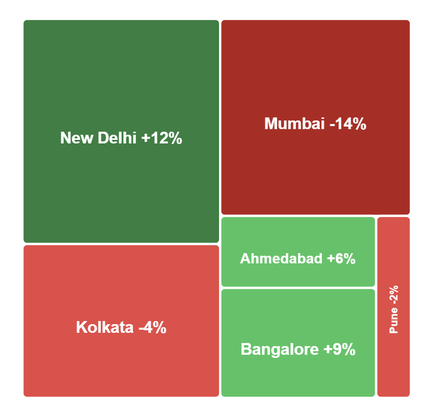
Treemap Chart
This example is based on the ApexCharts treemap demo “color range”.
import { TreeMapChart } from '@/afcl'

const deltaToColor = (delta: number) => {
  if (delta < -10) return '#B91C1C' // bright red
  if (delta < 0) return '#EF4444'   // red
  if (delta <= 10) return '#22C55E' // green
  return '#15803D'                 // very green
}

const formatDelta = (delta: number) => (delta > 0 ? `+${delta}%` : `${delta}%`)

const data = [
  { x: 'New Delhi', value: 218, delta: 12 },
  { x: 'Kolkata', value: 149, delta: -4 },
  { x: 'Mumbai', value: 184, delta: -14 },
  { x: 'Ahmedabad', value: 55, delta: 6 },
  { x: 'Bangalore', value: 84, delta: 9 },
  { x: 'Pune', value: 31, delta: -2 },
  { x: 'Chennai', value: 70, delta: 0 }
]

// Optional: precompute per-point color using delta
const dataWithColors = data.map((item) => ({
  ...item,
  fillColor: deltaToColor(item.delta),
}))

const series = [
  { name: 'Desktops', fieldName: 'value' },
]
<TreeMapChart
  :data="dataWithColors"
  :series="series"
  :options="{
    chart: { height: 350 },
    dataLabels: {
      formatter: (text, { seriesIndex, dataPointIndex, w }) => {
        const point = w?.config?.series?.[seriesIndex]?.data?.[dataPointIndex]
        if (!point) return text
        return `${text} ${formatDelta(point.delta)}`
      },
    },
    plotOptions: {
      treemap: {
        distributed: false,
        enableShades: false,
      },
    },
    tooltip: {
      y: {
        formatter: (value, { seriesIndex, dataPointIndex, w }) => {
          const point = w?.config?.series?.[seriesIndex]?.data?.[dataPointIndex]
          if (!point) return value
          return `${point.value} (${formatDelta(point.delta)})`
        },
      },
    },
  }"
/>
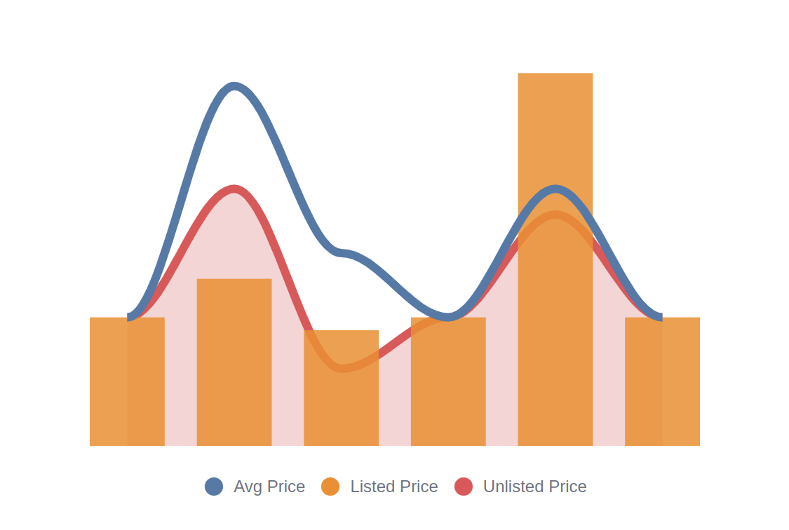
Mixed Chart
import { MixedChart } from '@/afcl'
Basic
<MixedChart
  :data="[
    { x: '02 Jun 2025', avgPrice: 100, listedPrice: 100, unlistedPrice: 100},
    { x: '03 Jun 2025', avgPrice: 280, listedPrice: 130, unlistedPrice: 200},
    { x: '04 Jun 2025', avgPrice: 150, listedPrice: 90, unlistedPrice: 60},
    { x: '05 Jun 2025', avgPrice: 100, listedPrice: 100, unlistedPrice: 100},
    { x: '06 Jun 2025', avgPrice: 200, listedPrice: 290, unlistedPrice: 180},
    { x: '07 Jun 2025', avgPrice: 100, listedPrice: 100, unlistedPrice: 100},
  ]"
  :series="[
    { name: $t('Avg Price'), fieldName: 'avgPrice', type: 'line', color: COLORS[0] },
    { name: $t('Listed Price'), fieldName: 'listedPrice', type: 'column', color: COLORS[1] },
    { name: $t('Unlisted Price'), fieldName: 'unlistedPrice', type: 'area', color: COLORS[2] },

  ]"
  :options="{
    chart: {
      height: 350,
    },
    stroke: {
      width: [6, 0, 6],  // Line: 6px, Column: 0px (no border), Area: 6px
    },
    fill: {
      opacity: [1, 0.85, 0.25], // Line: 1, Column: 0.85, Area: 0.25
    },
  }"
/>
Json Viewer
import { JsonViewer } from '@/afcl'
Basic
    <JsonViewer
    :value="[
      {
        id: 1,
        name: 'Alice',
        meta: {
          age: 30,
          hobbies: ['reading', 'biking'],
        }
      },
      {
        id: 2,
        name: 'Bob',
      }
    ]"
    :expandDepth="2"
  />

Modal
import { Modal, Button } from '@/afcl';
  <Modal class="w-96" :closeByClickOutside="true" :closeByEsc="true" askForCloseConfirmation >
    <template #trigger>
      <Button>Modal Toggle</Button>
    </template>

    <div class="space-y-4 p-4">
      <p>This is the first paragraph of modal content.</p>
      <p>And this is the second paragraph.</p>
    </div>
  </Modal>
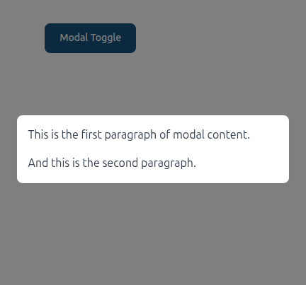
Props:
  closeByClickOutside?: boolean  // Close on click outside of modal (default is true)
  closeByEsc?: boolean // Close on Esc button click (default is true)
  beforeCloseFunction?: (() => void | Promise<void>) | null // Callback, that will be executed before open
  beforeOpenFunction?: (() => void | Promise<void>) | null // Callback, that will be executed before close
  askForCloseConfirmation?: boolean // Show extra popup to confirm close ( to avoid close by accident)
  closeConfirmationText?: string // Text that will be shown on close confirmation popup
  removeFromDomOnClose?: boolean // Remove modal from DOM on close ( default is false )
Date picker
import { DatePicker } from '@/afcl';
const datePickerValue = ref()
Basic
<DatePicker
  v-model:valueStart="datePickerValue"
  :column="{ type: 'datetime' }"
  label="Pick start"
/>
