Page Injections
In addition to ability to create custom pages and overwrite how fields are rendered, you can also inject custom components in standard AdminForth page.
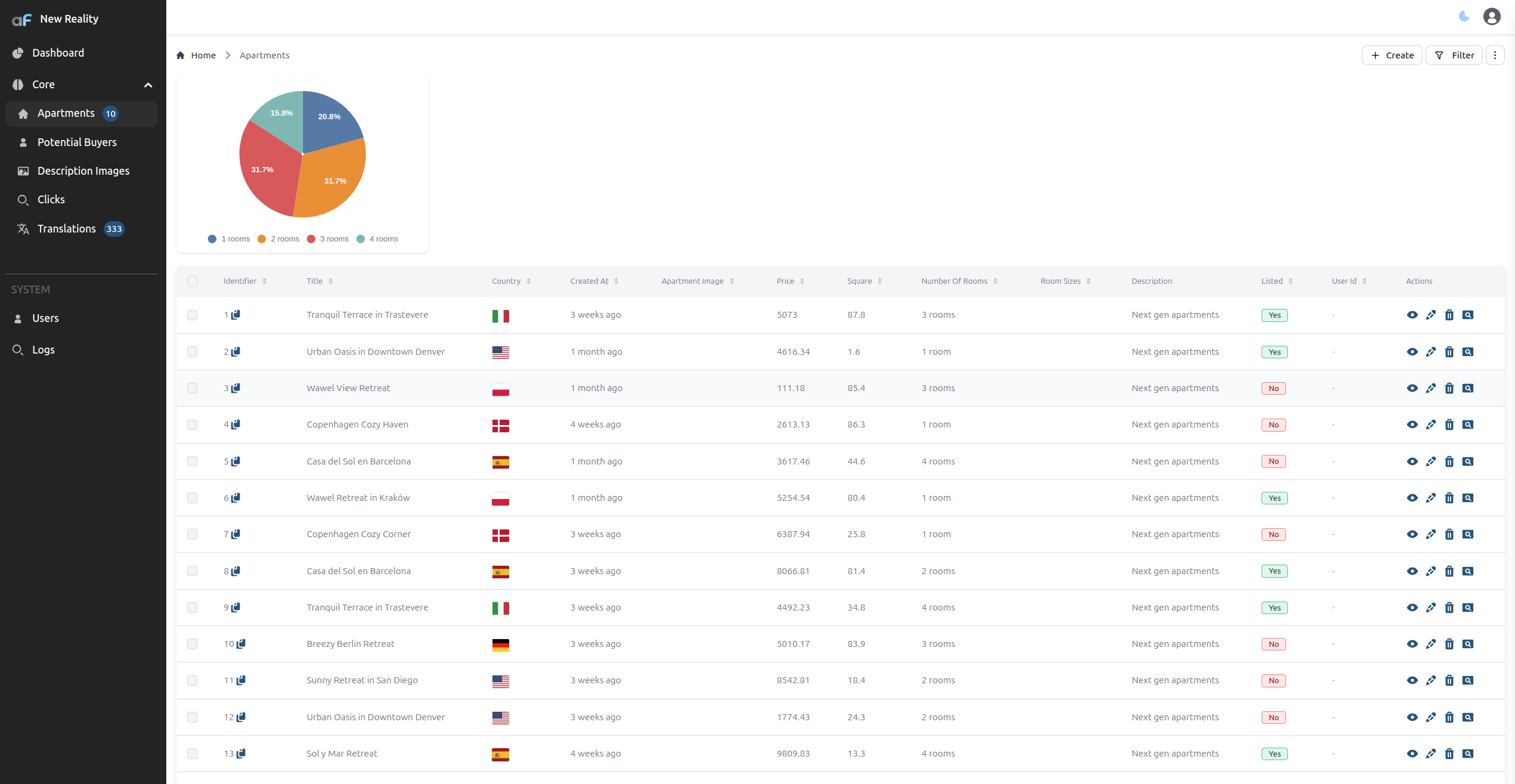
For example let's add a custom pie chart to the list page of the aparts resource. Pie chart will show the distribution of the rooms count and more over will allow to filter the list by the rooms count.
{
  resourceId: 'aparts',
  ...
  options: {
    pageInjections: {
      list: {
        afterBreadcrumbs: '@@/ApartsPie.vue',
      }
    }
  }
}
Now create file ApartsPie.vue in the custom folder of your project:
<template>
    <div class="max-w-sm w-full bg-white rounded-lg shadow dark:bg-gray-800 p-4 md:p-4 mb-5">
      <PieChart
        v-if="data.length"
        :data="rooms"
        :options="{
          chart: {
            height: 250,
            events: {
              dataPointSelection: function (event, chartContext, config) {
                if (config.selectedDataPoints[0].length) {
                  const selectedRoomsCount = data[config.dataPointIndex].rooms;
                  adminforth.list.updateFilter({field: 'number_of_rooms', operator: 'eq', value: selectedRoomsCount});
                } else {
                  // clear filter
                  adminforth.list.updateFilter({field: 'number_of_rooms', value: undefined});
                }
              }
            }
          },
          dataLabels: {
            enabled: true,
          },
          plotOptions: {
            pie: {
              dataLabels: {
                offset: -10,
                minAngleToShowLabel: 10,
              },
              expandOnClick: true,
            },
          },
        }"
      />
      <div v-else>Loading...</div>
    </div>
  </template>


  <script setup lang="ts">
  import { onMounted, ref, Ref, computed } from 'vue';
  import { PieChart } from '@/afcl';
  import { callApi } from '@/utils';
  import { useAdminforth } from '@/adminforth';


  const data: Ref<any[]> = ref([]);

  const { alert } = useAdminforth();

  const COLORS = ["#4E79A7", "#F28E2B", "#E15759", "#76B7B2", "#59A14F"]
  const rooms = computed(() => {
    return data.value?.map(
      (item, i) => ({
        label: item.rooms + ' rooms',
        amount: item.percentage,
        color: COLORS[i],
      })
    );
  });

  onMounted(async () => {
    try {
    data.value = await callApi({ path: '/api/aparts-by-room-percentages', method: 'GET' });
    } catch (error) {
      alert({
        message: `Error fetching data: ${error.message}`,
        variant: 'danger',
        timeout: 'unlimited'
      });
      return;
    }
  })

  </script>
Also we have to add an Api to get percentages:
import type { IAdminUserExpressRequest } from 'adminforth';
import express from 'express';
import * as z from 'zod';

....

  app.get(`${ADMIN_BASE_URL}/api/aparts-by-room-percentages/`,
    admin.express.withSchema(
      {
        description: 'Returns apartment room-count percentages for the page injection chart.',
        response: z.array(z.object({
          rooms: z.number(),
          percentage: z.number(),
        })),
      },
      admin.express.authorize(
        async (req: IAdminUserExpressRequest, res: express.Response) => {
        const roomPercentages = await admin.resource('aparts').dataConnector.client.prepare(
          `SELECT
            number_of_rooms,
            COUNT(*) as count
          FROM apartments
          GROUP BY number_of_rooms
          ORDER BY number_of_rooms;
          `
        ).all()


        const totalAparts = roomPercentages.reduce((acc, { count }) => acc + count, 0);

        res.json(
          roomPercentages.map(
            ({ number_of_rooms, count }) => ({
              rooms: number_of_rooms,
              percentage: Math.round(count / totalAparts * 100),
            })
          )
        );
        }
      )
    )
  );
Install and import Zod before using this pattern: pnpm add zod or npm install zod, then import * as z from 'zod';. admin.express.withSchema(...) will convert the Zod schema to OpenAPI for you.
☝️ Please note that we are using Frontend API
adminforth.list.updateFilter({field: 'number_of_rooms', operator: 'eq', value: selectedRoomsCount});to set filter when we are located on apartments list page
☝️ The outer
admin.express.withSchema(...)wrapper makes this custom Express route appear in/api/v1/openapi.jsonand/api-docs.
Here is how it looks:
Login page customization
You can also inject custom components to the login page.
loginPageInjections.underInputs and loginPageInjections.panelHeader allows to add one or more panels under or over the login form inputs:
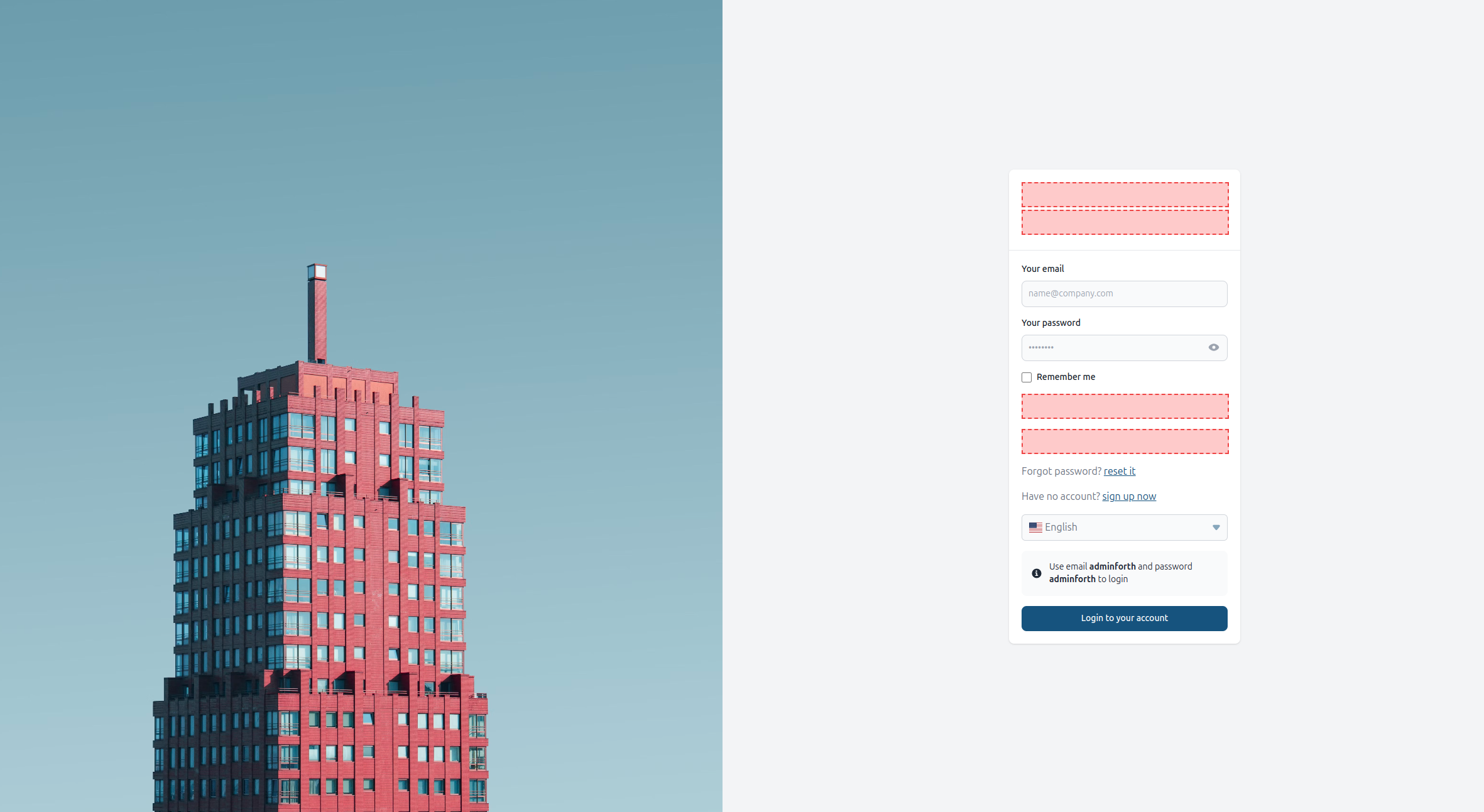
For example:
new AdminForth({
  ...
  customization: {
    loginPageInjections: {
      underInputs: '@@/CustomLoginFooter.vue',
    }
    ...
  }

  ...
})
Now create file CustomLoginFooter.vue in the custom folder of your project:
<template>
  <div class="text-center text-gray-500 text-sm mt-4">
    {{$t('By logging in, you agree to our')}} <a href="#" class="text-blue-500">{{$t('Terms of Service')}}</a> {{$t('and')}} <a href="#" class="text-blue-500">{{$t('Privacy Policy')}}</a>
  </div>
</template>
Also you can add panelHeader
new AdminForth({
  ...
  customization: {
    loginPageInjections: {
      underInputs: '@@/CustomLoginFooter.vue',
      panelHeader: '@@/CustomLoginHeader.vue',
    }
    ...
  }

  ...
})
Now create file CustomLoginHeader.vue in the custom folder of your project:
<template>
    <div class="flex items-center justify-center gap-2">
        <div class="text-2xl text-black dark:text-white font-bold">
          AdminForth
        </div>
    </div>
</template>
Reacting to rejected login attempts
Components injected into underInputs and underLoginButton get a failedLoginAttempts prop, which is incremented every time
the login endpoint answers with an error. Use it when your injection has to be refreshed for the next attempt, e.g. a captcha widget
has to issue a new token. Such injections can also disable the login button until they are ready, by emitting update:disableLoginButton:
<script setup lang="ts">
import { watch } from 'vue';

const props = defineProps<{ failedLoginAttempts?: number }>();
const emit = defineEmits(['update:disableLoginButton']);

watch(() => props.failedLoginAttempts, () => {
  emit('update:disableLoginButton', true);
  // prepare the injection for the next attempt, then enable the button back
});
</script>
Passing custom parameters to login hooks
Any login page injection can add a parameter to the built-in /login request by emitting
update:setLoginParam with a name and value. Emit undefined as the value to remove the parameter.
For example, a custom CAPTCHA component can pass its token from the provider callbacks:
<script setup lang="ts">
const emit = defineEmits<{
  (event: 'update:setLoginParam', name: string, value: string | undefined): void;
}>();

// Call these from your CAPTCHA provider's success and expiry callbacks.
function onCaptchaVerified(token: string) {
  emit('update:setLoginParam', 'captchaToken', token);
}

function onCaptchaExpired() {
  emit('update:setLoginParam', 'captchaToken', undefined);
}
</script>
The parameter is sent alongside username, password, and rememberMe. The built-in form
owns those three fields, so custom parameters cannot replace them. Login hooks that receive extra
can read the custom value from extra.body:
auth: {
  beforeLoginAttempt: async ({ extra }) => {
    const captchaToken = extra.body.captchaToken;
    if (!captchaToken || !await verifyCaptchaToken(captchaToken)) {
      return { ok: false, error: 'CAPTCHA verification failed' };
    }
    return { ok: true };
  },
}
Wire the component callbacks to your CAPTCHA widget and implement verifyCaptchaToken with
server-side verification from your CAPTCHA provider. The Login Captcha plugin
provides a ready-made integration.
beforeLoginConfirmation and afterSessionCreated also receive the login request body through
extra.body. These parameters belong to the login request; AdminForth does not automatically use
them to look up users or store them in the session.
Replacing the login page
Replacing the login page requires ongoing maintenance.
Prefer CSS customization and login page injections over replacing the entire login page. These extension points let you customize the page while retaining the behavior and compatibility maintained by AdminForth.
When replacing the page, you are responsible for preserving the correct form field types and autocomplete attributes, required plugin injection points, and layouts that accommodate additional authentication methods. Missing or modified elements can interfere with password managers, prevent authentication plugins from working correctly, or cause layout issues when new plugins are installed.
Your custom page will not automatically inherit security-related fixes, compatibility improvements, or new integration points added to the default page. You must review and incorporate relevant changes when upgrading AdminForth.
If the existing injection points do not cover your use case, please open an issue describing the customization you need before maintaining a separate login page.
customization.loginPage replaces the built-in login page with your own component:
new AdminForth({
  ...
  customization: {
    loginPage: '@@/CustomLoginPage.vue',
  }
  ...
})
The route keeps the /login path and the login name, so redirects to the login page (after logout,
on an expired session, from pages that require authentication) open your component. Like for
custom pages, you can pass
{ file, meta } instead of a path. meta is merged into the route meta, e.g. meta: { title: 'Sign in' }
changes the browser tab title.
Wrapping the built-in login page
If you only need to add something around the login form, wrap the built-in page instead of re-implementing it.
The form, the injections and the auth options (loginPromptHTML, loginBackgroundImage, demoCredentials and others) keep working:
<template>
  <div class="relative">
    <LoginView />
    <a href="https://example.com" class="absolute top-4 left-4 z-50 text-sm text-lightPrimary dark:text-darkPrimary">
      ← {{ $t('Back to website') }}
    </a>
  </div>
</template>

<script setup lang="ts">
import LoginView from '@/views/LoginView.vue';
</script>
Writing a login page from scratch
A login page written from scratch has to implement the following contract:
- Send credentials to the
/loginendpoint withcallAdminForthApi:{ username, password, rememberMe }, plus parameters emitted by injections viaupdate:setLoginParam(hooks read them fromextra.body). Show the "Remember me" checkbox only whencoreStore.config.rememberMeDurationis set. - Handle the response:
error— the attempt was rejected, show the message and incrementfailedLoginAttempts;redirectTo— one more step is required, e.g. a two-factor code: calluserStore.authorize(),await coreStore.fetchMenuAndResource()androuter.push(resp.redirectTo);- otherwise — call
await userStore.finishLogin(), it opens the page from thenextquery parameter or the home page.
- Keep
name="username" autocomplete="username"andtype="password" autocomplete="current-password"on the inputs, otherwise password managers will not fill them. - Render
coreStore.config.loginPageInjections(panelHeader,underInputs,underLoginButton) with themetaandfailedLoginAttemptsprops and theupdate:setLoginParam,update:disableLoginButtonandupdate:oauthRedirectingevents. Plugins such as OAuth, Two-Factor Authentication passkeys and Login Captcha add their buttons and widgets through these injections. loginPromptHTML,loginBackgroundImage,loginBackgroundPosition,removeBackgroundBlendModeanddemoCredentialsare rendered by the built-in page only. Read them fromcoreStore.configif your page should support them (loginPromptHTMLis loaded bycoreStore.getLoginFormConfig()).
A minimal page which implements the contract:
<template>
  <div class="flex items-center justify-center min-h-screen bg-lightHtml dark:bg-darkHtml">
    <Spinner v-if="oauthRedirecting" class="w-10 h-10" />
    <div v-show="!oauthRedirecting" class="w-full max-w-[400px] p-6 bg-lightLoginViewBackground dark:bg-darkLoginViewBackground rounded-default shadow">
      <component
        v-for="(c, index) in coreStore.config?.loginPageInjections.panelHeader"
        :key="`panel-header-${index}`"
        :is="getCustomComponent(formatComponent(c))"
        :meta="formatComponent(c).meta"
        @update:setLoginParam="setLoginParam"
      />
      <form class="flex flex-col gap-4" @submit.prevent>
        <Input v-model="username" type="text" name="username" autocomplete="username" class="w-full"
          :placeholder="coreStore.config?.usernameFieldName" required />
        <Input v-model="password" type="password" name="password" autocomplete="current-password" class="w-full"
          placeholder="••••••••" required @keydown.enter="login" />
        <Checkbox v-if="coreStore.config?.rememberMeDuration" v-model="rememberMe">
          {{ $t('Remember me') }}
        </Checkbox>
        <component
          v-for="(c, index) in coreStore.config?.loginPageInjections.underInputs"
          :key="`under-inputs-${index}`"
          :is="getCustomComponent(formatComponent(c))"
          :meta="formatComponent(c).meta"
          :failedLoginAttempts="failedLoginAttempts"
          @update:disableLoginButton="disableLoginButton = $event"
          @update:setLoginParam="setLoginParam"
        />
        <Button @click="login" :loader="inProgress" :disabled="inProgress || disableLoginButton">
          {{ $t('Login to your account') }}
        </Button>
        <component
          v-for="(c, index) in coreStore.config?.loginPageInjections.underLoginButton"
          :key="`under-login-button-${index}`"
          :is="getCustomComponent(formatComponent(c))"
          :meta="formatComponent(c).meta"
          :failedLoginAttempts="failedLoginAttempts"
          @update:disableLoginButton="disableLoginButton = $event"
          @update:setLoginParam="setLoginParam"
          @update:oauthRedirecting="oauthRedirecting = $event"
        />
        <p v-if="error" class="text-sm text-red-600 dark:text-red-400">{{ error }}</p>
      </form>
    </div>
  </div>
</template>

<script setup lang="ts">
import { ref } from 'vue';
import { useRoute, useRouter } from 'vue-router';
import { Button, Checkbox, Input, Spinner } from '@/afcl';
import { useCoreStore } from '@/stores/core';
import { useUserStore } from '@/stores/user';
import { callAdminForthApi, formatComponent, getCustomComponent } from '@/utils';

const coreStore = useCoreStore();
const userStore = useUserStore();
const router = useRouter();

const username = ref('');
const password = ref('');
const rememberMe = ref(false);
const error = ref<string | null>(null);
const inProgress = ref(false);
const disableLoginButton = ref(false);
const failedLoginAttempts = ref(0);
// the OAuth plugin hides the form while it redirects to the provider
const oauthRedirecting = ref('start_oauth' in useRoute().query);
const loginParams = new Map<string, unknown>();

function setLoginParam(name: string, value: unknown) {
  if (value === undefined) {
    loginParams.delete(name);
  } else {
    loginParams.set(name, value);
  }
}

async function login() {
  inProgress.value = true;
  const resp = await callAdminForthApi({
    path: '/login',
    method: 'POST',
    body: {
      ...Object.fromEntries(loginParams),
      username: username.value,
      password: password.value,
      rememberMe: rememberMe.value,
    },
  });
  if (resp.error) {
    error.value = resp.error;
    failedLoginAttempts.value++;
    inProgress.value = false;
  } else if (resp.redirectTo) {
    // one more step is required, e.g. a two-factor code
    userStore.authorize();
    await coreStore.fetchMenuAndResource();
    await router.push(resp.redirectTo);
  } else {
    await userStore.finishLogin();
  }
}
</script>
List view page injections shrinking: thin enough to shrink?
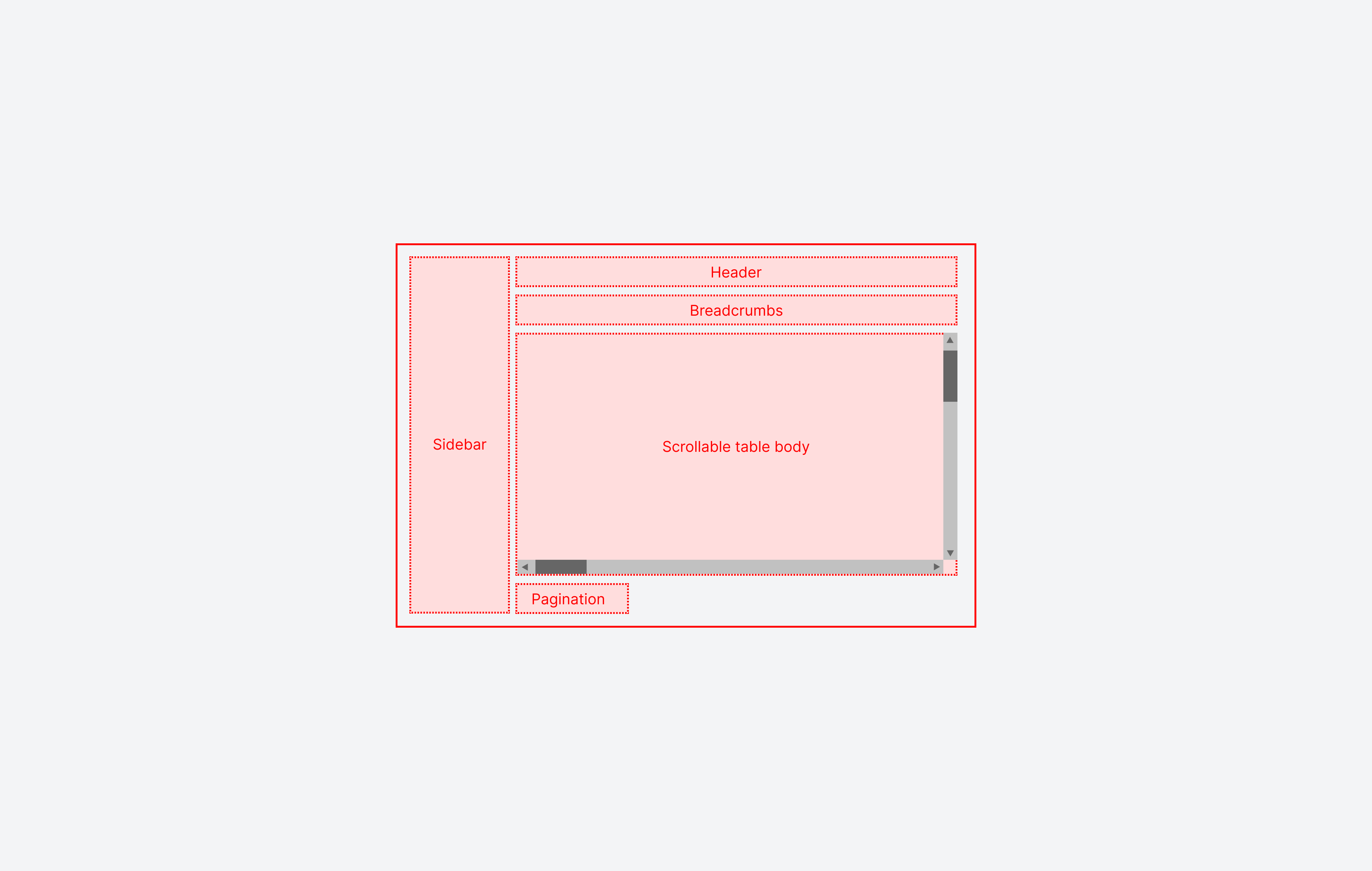
When none of bottom, beforeBreadcrumbs, beforeActionButtons, afterBreadcrumbs injections are set in list table, the table tries to shrink into viewport for better UX. In other words, in this default mode it moves scroll from body to the table itself:
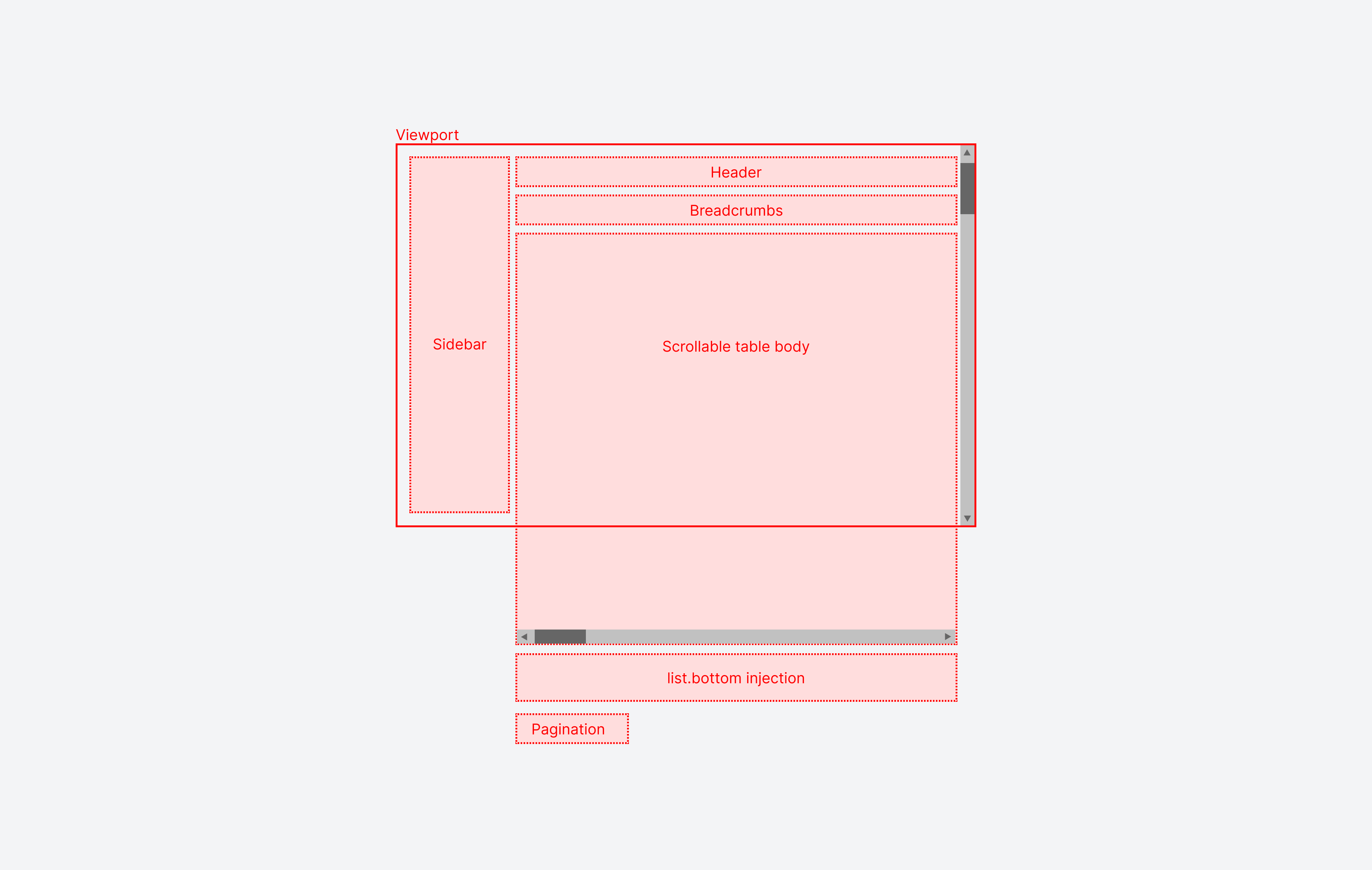
However if one of the above injections is set, the table will not try to shrink it's height into viewport and will have a fixed height. We apply this behavior because generally page injection might take a lot of height and table risks to be too small to be usable. So vertical scroll is moved to the body (horizontal scroll is still on the table):
However, if you intend to use injection as a small panel, you can set meta.thinEnoughToShrinkTable to true in the injection instantiation:
{
  resourceId: 'aparts',
  ...
  options: {
    pageInjections: {
      list: {
        bottom: {
          file: '@@/<ComponentForBottomPanel>.vue',
          meta: {
            thinEnoughToShrinkTable: true,
          }
        }
      }
    }
  }
}
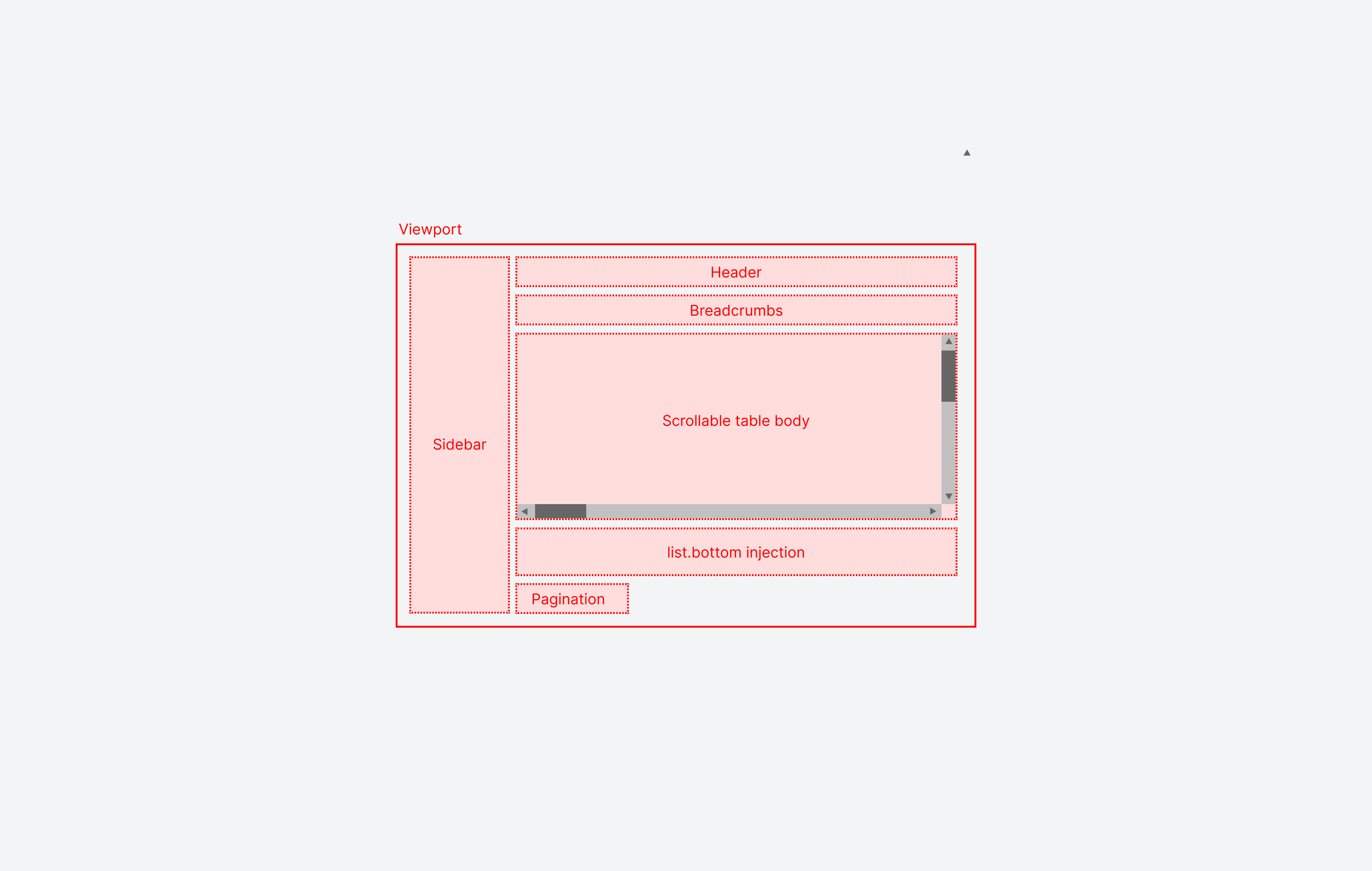
If at least one injection will not set or will not define meta.thinEnoughToShrinkTable as true, the table will not try to shrink into viewport.
Three dots menu customization
You can also inject custom components to the three dots menu on the top right corner of the page.
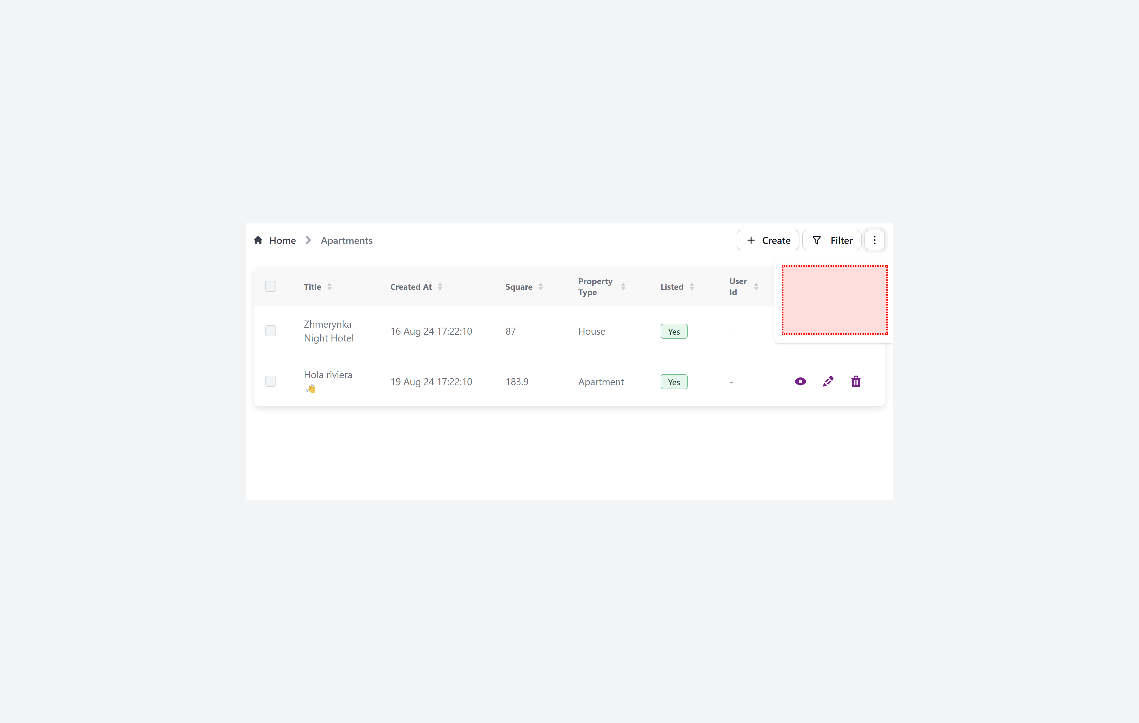
{
  resourceId: 'aparts',
  ...
  options: {
    pageInjections: {
      show: {
          threeDotsDropdownItems: [
            '@@/CheckReadingTime.vue',
          ]
      }
    }
  }
}
Now create file CheckReadingTime.vue in the custom folder of your project:
<template>
  <div class="text-gray-500 text-sm">
    <div class="cursor-pointer flex gap-2 items-center">
      Check reading time
    </div>
  </div>
</template>

<script setup>
import { getReadingTime} from "text-analyzer";
import { useAdminforth } from '@/adminforth';

defineExpose({
  click,
});

const { alert, list } = useAdminforth();

function checkReadingTime() {
  const text = document.querySelector('[data-af-column="description"]')?.innerText;
  if (text) {
    const readingTime = getReadingTime(text);
    alert({
      message: `Reading time: ${readingTime.minutes} minutes`,
      variant: 'success',
    });
  }
  list.closeThreeDotsDropdown();
}

function click() {
  checkReadingTime();
}

</script>
For this demo we will use text-analyzer package:
cd custom
pnpm i text-analyzer
☝️ Please note that we are using AdminForth Frontend API
list.closeThreeDotsDropdown();to close the dropdown after the item is clicked.
☝️ Please note that the injected component might have an exposed click function as well as a defined click function, which executes the click on component logic.
List table custom action icons
customActionIcons allows to add custom actions to the list page
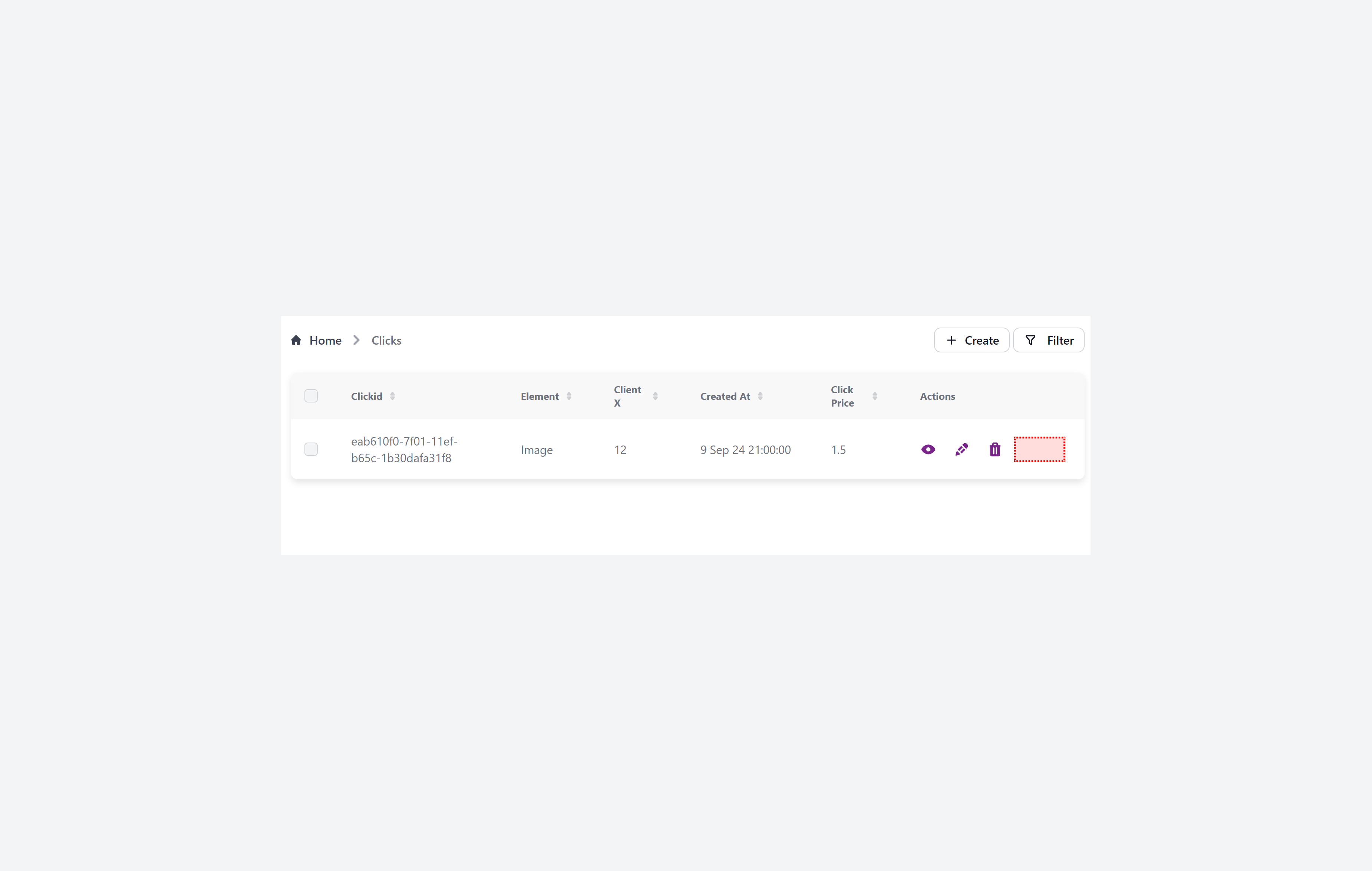
{
  resourceId: 'aparts',
  ...
  options: {
    pageInjections: {
      list: {
          customActionIcons: [
            '@@/SearchForApartmentInGoogle.vue',
          ]
      }
    }
  }
}
Now create file SearchForApartmentInGoogle.vue in the custom folder of your project:
<template>
    <Tooltip>
        <a :href="`https://google.com?q=${record.title}`">
            <IconCardSearch class="w-5 h-5 me-2"/>
        </a>

        <template #tooltip>
            {{$t('Search for competitive apartments in Google')}}
        </template>
    </Tooltip>
</template>

<script setup lang="ts">
import { IconCardSearch } from '@iconify-prerendered/vue-mdi';
import Tooltip from '@/afcl/Tooltip.vue';
import type { AdminForthResourceColumnCommon, AdminForthResourceCommon, AdminUser } from '@/types/Common';

const props = defineProps<{
  column: AdminForthResourceColumnCommon;
  record: any;
  meta: any;
  resource: AdminForthResourceCommon;
  adminUser: AdminUser
}>();
</script>
Install used icon:
cd custom
pnpm i @iconify-prerendered/vue-mdi
List table row replace injection
tableRowReplace lets you fully control how each list table row is rendered. Instead of the default table <tr>…</tr> markup, AdminForth will mount your Vue component per record and use its returned DOM to display the row. Use this when you need custom row layouts, extra controls, or conditional styling that goes beyond column-level customization.
Supported forms:
- Single component:
pageInjections.list.tableRowReplace = '@@/MyRowRenderer.vue' - Object form with meta:
pageInjections.list.tableRowReplace = { file: '@@/MyRowRenderer.vue', meta: { /* optional */ } } - If an array is provided, the first element is used.
Example configuration:
{
  resourceId: 'aparts',
  ...
  options: {
    pageInjections: {
      list: {
        tableRowReplace: {
          file: '@@/ApartRowRenderer.vue',
          meta: {
            // You can pass any meta your component may read
          }
        }
      }
    }
  }
}
Minimal component example (decorate default row with a border):
<template>
  <tr class="border border-gray-200 dark:border-gray-700 rounded-sm">
    <slot />
  </tr>

</template>

<script setup lang="ts">
import { computed } from 'vue';
const props = defineProps<{
  record: any
  resource: any
  meta: any
  adminUser: any
}>();
</script>
Component contract:
- Inputs
record: the current record objectresource: the resource config objectmeta: the meta object passed in the injection config
- Slots
- Default slot: the table’s standard row content (cells) will be projected here. Your component can wrap or style it.
- Output
- Render a full
<tr>…</tr>fragment. For example, to replace the standard set of cells with a single full‑width cell, render:
- Render a full
<tr>
  <td :colspan="columnsCount">
    <slot />
  </td>
</tr>
Notes and tips:
- Requirements:
- Required
<tr></tr>structure around<slot />
- Required
List table three dots menu injection
customActionIconsThreeDotsMenuItems allows to inject component inside three dots menu for each recod in list table.
  options: {
    pageInjections: {
      list: {
        customActionIconsThreeDotsMenuItems: {
          file: '@@/ApartRowRenderer.vue',
          meta: {
            // You can pass any meta your component may read
          }
        }
      }
    }
  }
List table beforeActionButtons
beforeActionButtons allows injecting one or more compact components into the header bar of the list page, directly to the left of the default action buttons (Create, Filter, bulk actions, three‑dots menu). Use it for small inputs (quick search, toggle, status chip) rather than large panels.
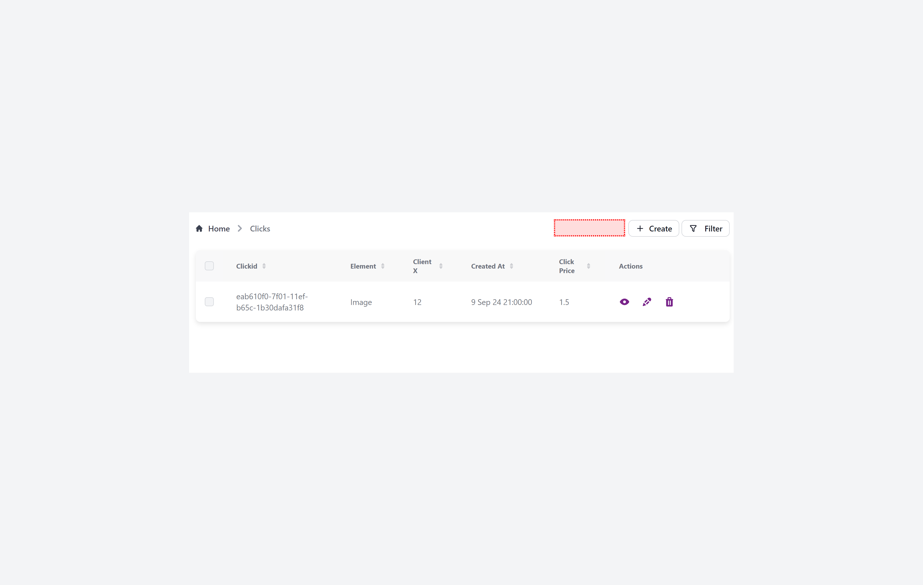
{
  resourceId: 'aparts',
  ...
  options: {
    pageInjections: {
      list: {
        beforeActionButtons: {
          file: '@@/UniversalQuickSearch.vue',
          meta: {
            thinEnoughToShrinkTable: true
          }
        }
      }
    }
  }
}
Multiple components:
beforeActionButtons: [
  {
    file: '@@/UniversalQuickSearch.vue',
    meta: { thinEnoughToShrinkTable: true }
  },
  {
    file: '@@/RecordsSummary.vue',
    meta: { thinEnoughToShrinkTable: true }
  }
]
☝️ Keep these components visually light; wide or tall content should use
afterBreadcrumbsorbottominstead.
List table custom
Global Injections
You have opportunity to inject custom components to the global layout. For example, you can add a custom items into user menu
config.customization.globalInjections.userMenu:
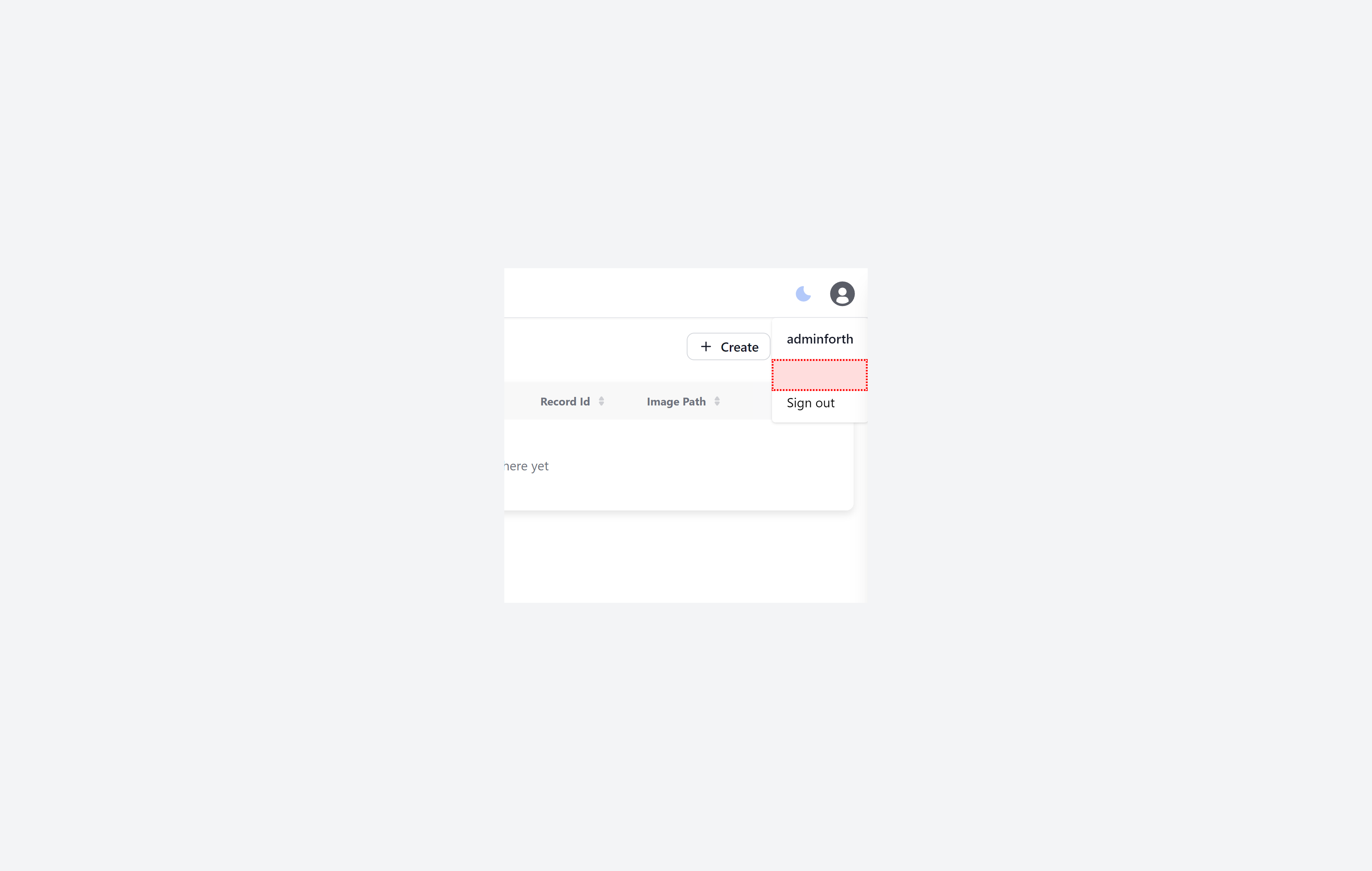
use closeUserMenuDropdown(); to close the dropdown after the item is clicked.
{
  ...
  customization: {
    globalInjections: {
      userMenu: [
        '@@/CustomUserMenuItem.vue',
      ]
    }
  }
  ...
}
Now create file CustomUserMenuItem.vue in the custom folder of your project:
<template>
  <div @click="openCustomPage" class="cursor-pointer flex px-4 py-2 text-sm flex items-center">
    Custom Page
  </div>
</template>

<script setup>
import { useAdminforth } from '@/adminforth';

const { alert, closeUserMenuDropdown } = useAdminforth()

function openCustomPage() {
  alert({
    message: 'Custom page is opened',
    variant: 'success',
  });
  closeUserMenuDropdown();
}
</script>
Also there are:
config.customization.globalInjections.headerconfig.customization.globalInjections.sidebarconfig.customization.globalInjections.sidebarTop— renders inline at the very top of the sidebar, on the same row with the logo/brand name. If the logo is hidden viashowBrandLogoInSidebar: false, this area expands to the whole row width.config.customization.globalInjections.everyPageBottom
Unlike userMenu, header and sidebar injections, everyPageBottom will be added to the bottom of every page even when user is not logged in.
You can use it to execute some piece of code when any page is loaded. For example, you can add welcoming pop up when user visits a page.
{
  ...
  customization: {
    globalInjections: {
      userMenu: [
        '@@/CustomUserMenuItem.vue',
      ]
      ],
      everyPageBottom: [
        '@@/AnyPageWelcome.vue',
      ]
    }
  }
  ...
}
Now create file AnyPageWelcome.vue in the custom folder of your project:
<template></template>

<script setup>
import { onMounted } from 'vue';
import { useAdminforth } from '@/adminforth';

const { alert } = useAdminforth();

onMounted(() => {
  alert({
    message: 'Welcome!',
    variant: 'success',
  });
});
</script>
Sidebar Top Injection
You can place compact controls on the very top line of the sidebar, next to the logo/brand name:
new AdminForth({
  ...
  customization: {
    globalInjections: {
      sidebarTop: [
        '@@/QuickSwitch.vue',
      ],
    }
  }
})
If you hide the logo with showBrandLogoInSidebar: false, components injected via sidebarTop will take the whole line width.
Injection order
Most of injections accept an array of components. By defult the order of components is the same as in the array. You can use standard array methods e.g. push, unshift, splice to put item in desired place.
However, if you want to control the order of injections dynamically, which is very handly for plugins, you can use meta.afOrder property in the injection instantiation. The higher the number, the earlier the component will be rendered. For example
{
  ...
  customization: {
    globalInjections: {
      userMenu: [
        {
          file: '@@/CustomUserMenuItem.vue',
          meta: { afOrder: 10 }
        },
        {
          file: '@@/AnotherCustomUserMenuItem.vue',
          meta: { afOrder: 20 }
        },
        {
          file: '@@/LastCustomUserMenuItem.vue',
          meta: { afOrder: 5 }
        },
      ]
    }
  }
  ...
}
Order of components inserted by plugins
For plugins, the plugin developers encouraged to use meta.afOrder to control the order of injections and allow to pass it from plugin options.
For example "OAuth2 plugin", when registers a login button component for login page injection, uses meta.afOrder and sets it equal to 'YYY' passed in plugin options:
// plugin CODE
adminforth.config.customization.loginPageInjections.underLoginButton.push({
    file: '@@/..vue',
    meta: {
      afOrder: this.pluginOptions.YYY || 0
    }
 })
So you can just pass YYY option to the plugin to control the order of the injection.
Custom scripts in head
If you want to inject tags in your html head:
customization: {
  ...
  customHeadItems: [
    {
      tagName: 'script',
      attributes: { async: 'true', defer: 'true' },
      innerCode: "console.log('Hello from HTML head')"
    }
  ],
...
}