Custom record field rendering
Customizing how AdminForth renders the cells with record values
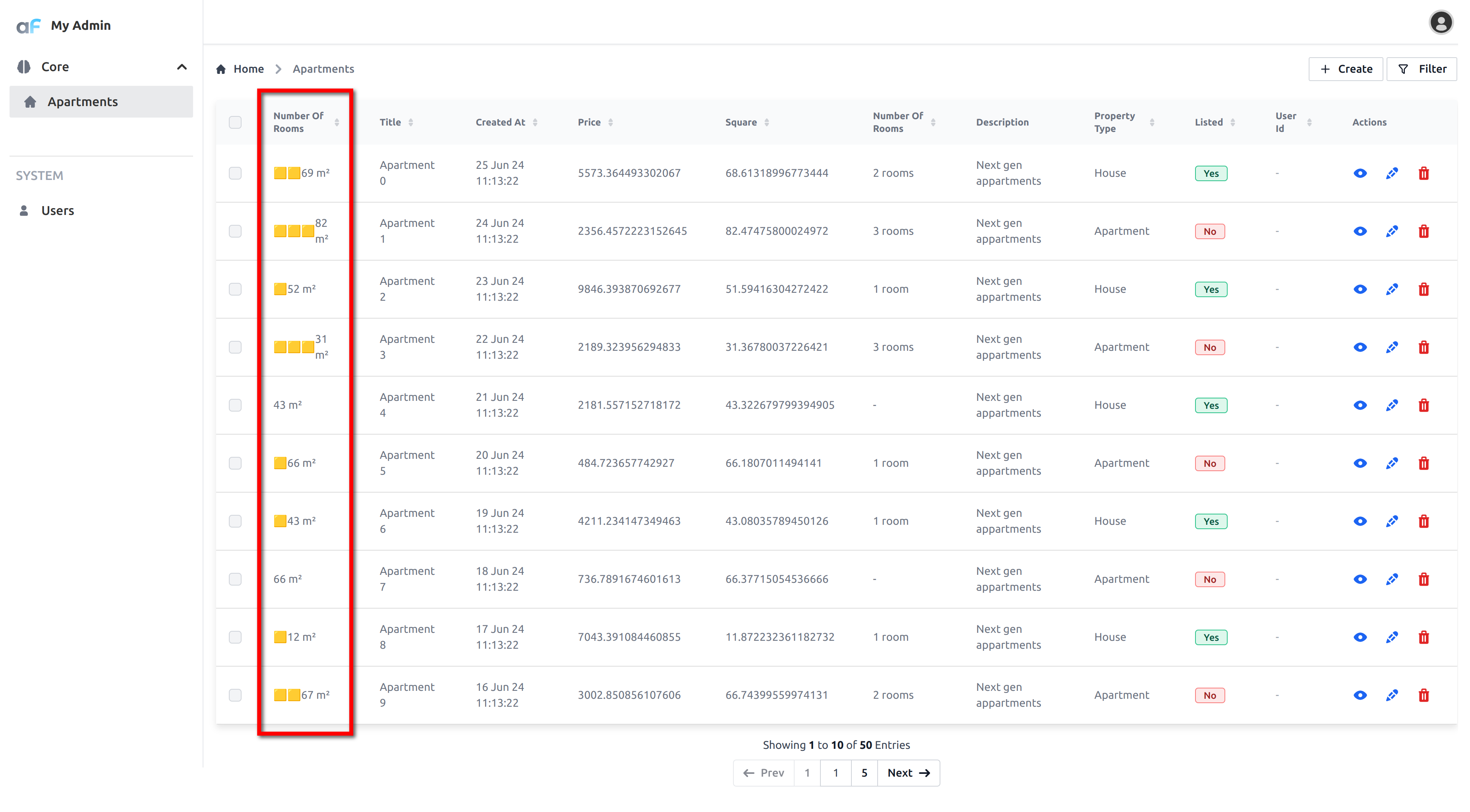
Let's change how AdminForth renders the number of rooms in the 'list' and 'show' views.
We will render '🟨' for each room and then we will print square_meter at the same cells.
Create directory custom. Create a file RoomsCell.vue in it:
<template>
  <div class="flex items-center">
    <span v-for="room in record.number_of_rooms">
      🟨
    </span>

    {{ record.square_meter }} m²
  </div>
</template>

<script setup lang="ts">
import type { AdminForthResourceColumnCommon, AdminForthResourceCommon, AdminUser } from '@/types/Common';

const props = defineProps<{
    column: AdminForthResourceColumnCommon;
    record: any;
    meta: any;
    resource: AdminForthResourceCommon;
    adminUser: AdminUser
}>();
</script>
Now you can use this component in the configuration of the resource:
{
  ...
  resourceId: 'aparts',
  columns: [
    ...
    {
      ...
      name: 'number_of_rooms',
      components: {
        show: '@@/RoomsCell.vue',
        list: '@@/RoomsCell.vue',
      }
    },
    ...
  ],
  ...
}
Here is how it looks:
In very similar way you can render how cell is rendered in 'edit' and 'create' view.
You can use it for creating custom editors for the fields. Check component specs to understand which props are passed to the component
Parametrize the custom components
Sometimes you need to render same component with different parameters. You can use full component declaration
{
  ...
  resourceId: 'aparts',
  columns: [
    ...
    {
      ...
      name: 'number_of_rooms',
      components: {
       show: '@@/RoomsCell.vue',
       show: {
         file: '@@/RoomsCell.vue',
         meta: {
           filler: '🟨',
         },
       },
       list: '@@/RoomsCell.vue',
       list: {
         file: '@@/RoomsCell.vue',
         meta: {
           filler: '🟦',
          },
        }
      }
    },
    ...
  ],
  ...
}
Now our component can read filler from meta prop:
<template>
  <div class="flex items-center">
    <span v-for="room in record.number_of_rooms">
     🟨
    {{ meta.filler }}
    </span>
    {{ room.square_meter }} m²
  </div>
</template>

<script setup lang="ts">
import type { AdminForthResourceColumnCommon, AdminForthResourceCommon, AdminUser } from '@/types/Common';

const props = defineProps<{
    column: AdminForthResourceColumnCommon;
    record: any;
    meta: any;
    resource: AdminForthResourceCommon;
    adminUser: AdminUser
}>();
</script>
Using 3rd-party npm packages in the Vue components
To install 3rd-party npm packages you should create npm package in the custom directory:
cd custom
And simply do pnpm install for the package you need:
pnpm i <some package> -D
Editing values component
In same way as we define show and list component, we can create component for edit/create page.
Let's create custom dropdown for country field which will show emoji flags of the countries.
<template>
  <Select
      class="w-full"
      :options="column.enum"
      :model-value="record[column.name]"
      @update:model-value="emit('update:value', $event)"
  >
    <template #item="{option}">
      <span class="text-xl inline-flex">{{ getCountryFlag(option.value) }}</span> {{ option.label }}
    </template>

    <template #selected-item="{option}">
      <span class="text-xl inline-flex">{{ getCountryFlag(option.value) }}</span> {{ option.label }}
    </template>
  </Select>
</template>

<script setup lang="ts">
import Select from "@/afcl/Select.vue";
import type {
  AdminForthResourceColumnCommon,
  AdminForthResourceCommon,
  AdminUser,
} from "@/types/Common";

const props = defineProps<{
  column: AdminForthResourceColumnCommon;
  record: any;
  meta: any;
  resource: AdminForthResourceCommon;
  adminUser: AdminUser;
  readonly: boolean;
}>();

const emit = defineEmits(["update:value"]);

function getCountryFlag(countryCode: string) {
  return countryCode?.toUpperCase()
    .replace(/./g, (char) => String.fromCodePoint(char.charCodeAt(0) + 127397));
}

</script>
Now you can use this component in the configuration of the resource:
{
  ...
  resourceId: 'aparts',
  columns: [
    ...
    {
      name: 'country',
      components: {
        edit: '@@/CountryDropdown.vue',
        create: '@@/CountryDropdown.vue',
      },
      ...
    },
    ...
  ],
  ...
}
Custom record editing (updating other fields)
Sometimes a custom editor needs to update not only its own field, but also other fields of the record (for example, generate a slug from a title).
For this, custom edit/create components can emit an update:recordFieldValue event with the payload { fieldName, fieldValue }. AdminForth will update the corresponding field in the record.
If you emit
update:recordFieldValueto modify a field which is hidden byshowIn.create: false/showIn.edit: false, the backend will reject the request by default. To allow this, set the target column config toallowModifyWhenNotShowInCreate: trueand/orallowModifyWhenNotShowInEdit: true.
<template>
  <div class="flex flex-col gap-2">
    <Input
      :model-value="record[column.name]"
      :placeholder="$t('Title')"
      @update:model-value="onTitleChange"
    />
    <Input
      :model-value="record.slug"
      :placeholder="$t('Slug')"
      readonly
    />
  </div>
</template>

<script setup lang="ts">
import Input from "@/afcl/Input.vue";
import type {
  AdminForthResourceColumnCommon,
  AdminForthResourceCommon,
  AdminUser,
} from "@/types/Common";

const props = defineProps<{
  column: AdminForthResourceColumnCommon;
  record: any;
  meta: any;
  resource: AdminForthResourceCommon;
  adminUser: AdminUser;
  readonly: boolean;
}>();

const emit = defineEmits([
  "update:value", // update current column value
  "update:recordFieldValue", // update any other field in the record
]);

function slugify(value: string) {
  return value
    ?.toLowerCase()
    .trim()
    .replace(/[^a-z0-9]+/g, "-")
    .replace(/(^-|-$)+/g, "");
}

function onTitleChange(newTitle: string) {
  // update current column value
  emit("update:value", newTitle);

  // update another field in the record (e.g. slug)
  emit("update:recordFieldValue", {
    fieldName: "slug",
    fieldValue: slugify(newTitle),
  });
}
</script>
And use it in the resource configuration for both edit and create views:
{
  ...
  resourceId: 'aparts',
  columns: [
    ...
    {
      name: 'title',
      components: {
        edit: '@@/TitleWithSlugEditor.vue',
        create: '@@/TitleWithSlugEditor.vue',
      },
    },
    {
      name: 'slug',
      // standard input; value will be kept in sync
      ...
    },
    ...
  ],
  ...
}
Custom inValidity inside of the custom create/edit components
Custom componets can emit update:inValidity event to parent to say that the field is invalid.
You can define this emit as:
const emit = defineEmits([
  "update:value",
  "update:inValidity"
]);
Every time when state in your component becomes invalid, you can emit this event with error message which will be shown in the UI to the user.
emit('update:inValidity', "The field has wrong value");
Every time when state in your component becomes valid, you can emit this event with false
emit('update:inValidity', false);
If component never emits update:inValidity event (includign case when you don't use it at all), the field is considered valid.
Custom emptiness inside of the custom create/edit components
Custom componets can emit update:emptiness event to parent to say that the field is empty.
Emptiness is used to prevent user from saving form when column.required is true and field is empty.
When column.required is false emptiness is not checked.
You can define this emit as:
const emit = defineEmits([
  "update:value",
  "update:emptiness"
]);
Every time when state in your component becomes empty, you can emit this event with true
emit('update:emptiness', true);
Every time when state in your component becomes not empty, you can emit this event with false
emit('update:emptiness', false);
Emptiness emit has a higher priority than natural emptiness of the field. For example when actual value under column in record is empty but component emitted false for update:emptiness (in other words child component said it non-empty), the field is considered as Non-empty.
For another example, if companent is naturally updated some value in record but emited true (said that it is empty) the field is considered as empty and error in form will be shown to user.
Pre-made renderers
Though creating custom renderers is super-easy, we have couple of pre-made renderers for you to use.
CompactUUID
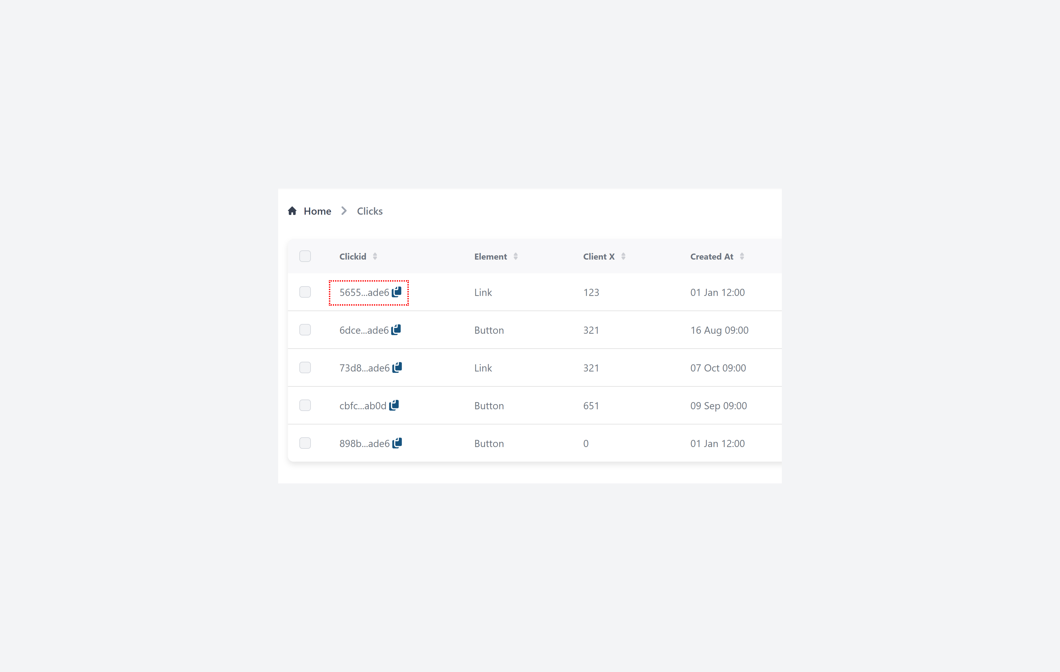
If you have a UUID column which you want display in table in more compact manner, you can use CompactUUID renderer.
import { randomUUID } from 'crypto';

  ...
  columns: [
    {
      name: 'id',
      primaryKey: true,
      showIn: {
        list: false,
        edit: false,
        create: false,
      },
      fillOnCreate: ({ initialRecord, adminUser }) => Math.random().toString(36).substring(7),
      fillOnCreate: ({initialRecord}: any) => randomUUID(),
      components: {
        list: '@/renderers/CompactUUID.vue'
      }
    }
  ...
Country Flag
Renders string fields containing ISO-3166-1 alpha-2 country codes as flags (e.g. 'US', 'DE', 'FR', etc.)
  columns: [
    ...
    {
      name: 'country',
      components: {
        list: '@/renderers/CountryFlag.vue'
      },
      ...
    }
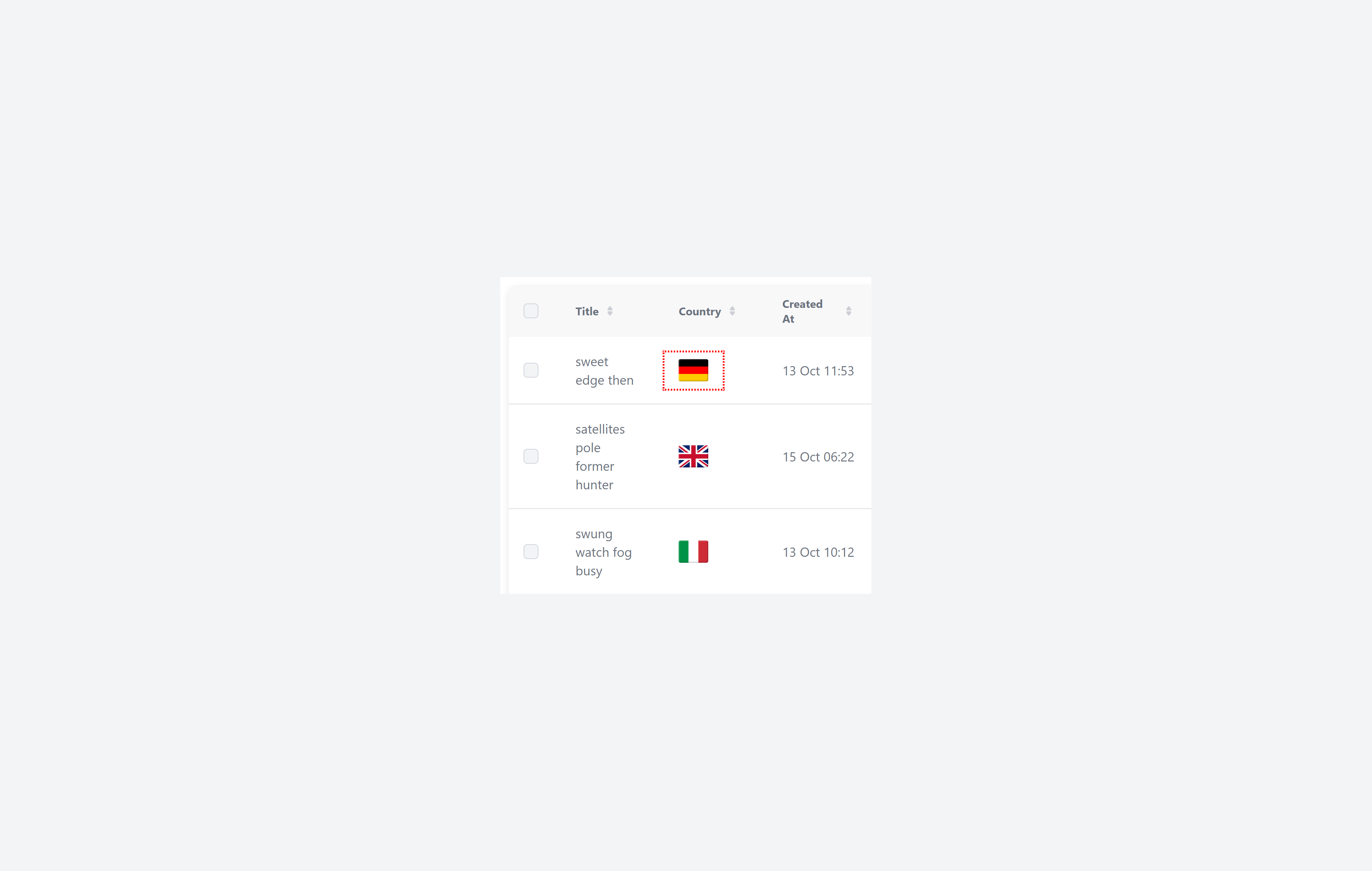
You can also show country name after the flag:
  columns: [
    ...
    {
      name: 'country',
      components: {
        list: {
          file: '@/renderers/CountryFlag.vue',
          meta: {
            showCountryName: true
          }
        }
      },
      ...
    }
-2b0124d7267e86fbd94cca307b19ba97.jpg)
Human Number
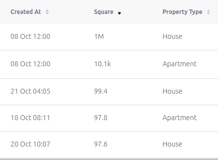
It formats large numbers into a human-readable format (e.g., 10k, 1.5M) and supports localization for different number formats.
  columns: [
    ...
    {
      name: 'square_meter',
      label: 'Square',
      minValue: 1,  // you can set min /max value for number fields
      maxValue: 100000000,
      components: {
        list: {
          file: '@/renderers/HumanNumber.vue',
        }
      }
    },
    {
    ...
URL
If your field has absolute URLs as text strings you can use URLs renderer to render them as clickable links.
  columns: [
    ...
    {
      name: 'url',
      components: {
        list: '@/renderers/URL.vue'
      },
    ...
Relative Time
To format your date fields to display the elapsed time, you can utilize the RelativeTime renderer.
  columns: [
    ...
    {
      name: 'created_at',
      components: {
        list: '@/renderers/RelativeTime.vue'
      },
    ...
Rich text and Zero-style Rich text
If you have some field which holds HTML content you can use RichText renderer to render it as HTML.
  columns: [
    ...
    {
      name: 'content',
      components: {
        list: '@/renderers/RichText.vue'
      },
      ...
    }
  ]
The renderer will render the HTML content and protect against XSS attacks.
If HTML in field has some tags or classes which covered by adminforth internal styles (including Tailwind classes), they will be styled (text/p styles etc). If this is an issue for your task and you need full raw preview of the HTML, you can use ZeroStyleRichText renderer:
list: '@/renderers/RichText.vue',
list: '@/renderers/ZeroStylesRichText.vue',
ZeroStyleRichText fits well for tasks like email templates preview fields.
Custom filter component for square meters
Sometimes standard filters are not enough, and you want to make a convenient UI for selecting a range of apartment areas. For example, buttons with options for “Small (<25 m²)”, “Medium (25–90 m²)” and “Large (>90 m²)”.
<template>
  <div class="flex flex-col gap-2">
    <p class="font-medium mb-1 dark:text-white">{{ $t('Square meters filter') }}</p>
    <div class="flex gap-2">
      <button
        v-for="option in options"
        :key="option.value"
        type="button"
        class="flex gap-1 items-center py-1 px-3 text-sm font-medium rounded-default border focus:outline-none focus:z-10 focus:ring-4"
        :class="{
          'text-white bg-blue-500 border-blue-500 hover:bg-blue-600 focus:ring-blue-200 dark:focus:ring-blue-800': selected === option.value,
          'text-gray-900 bg-white border-gray-300 hover:bg-gray-100 hover:text-blue-500 focus:ring-gray-100 dark:focus:ring-gray-700 dark:bg-gray-800 dark:text-gray-400 dark:border-gray-600 dark:hover:text-white dark:hover:bg-gray-700': selected !== option.value
        }"
        @click="select(option.value)"
      >
        {{ $t(option.label) }}
      </button>
    </div>
  </div>
</template>

<script setup lang="ts">
import { ref, watch, onMounted } from 'vue';

const emit = defineEmits(['update:modelValue']);

const props = defineProps<{
  modelValue: Array<{ operator: string; value: number }> | null;
}>();

const selected = ref<string | null>(null);

const options = [
  { value: 'small', label: 'Small' },
  { value: 'medium', label: 'Medium' },
  { value: 'large', label: 'Large' }
];

onMounted(() => {
  const val = props.modelValue;
  if (!val || val.length === 0) {
    selected.value = null;
    return;
  }

  const ops = val.map((v) => `${v.operator}:${v.value}`);

  if (ops.includes('lt:25')) selected.value = 'small';
  else if (ops.includes('gte:25') && ops.includes('lte:90')) selected.value = 'medium';
  else if (ops.includes('gt:90')) selected.value = 'large';
  else selected.value = null;
});

watch(selected, (size) => {
  if (!size) {
    emit('update:modelValue', []);
    return;
  }

  const filters = {
    small: [{ operator: 'lt', value: 25 }],
    medium: [
      { operator: 'gte', value: 25 },
      { operator: 'lte', value: 90 }
    ],
    large: [{ operator: 'gt', value: 90 }]
  };

  emit('update:modelValue', filters[size]);
});

function select(size: string) {
  selected.value = size;

  switch (size) {
    case 'small':
      emit('update:modelValue', [{ operator: 'lt', value: 25 }]);
      break;
    case 'medium':
      emit('update:modelValue', [
        { operator: 'gte', value: 25 },
        { operator: 'lte', value: 90 }
      ]);
      break;
    case 'large':
      emit('update:modelValue', [{ operator: 'gt', value: 90 }]);
      break;
  }
}
</script>
  columns: [
    ...
    {
      name: 'square_meter',
      label: 'Square',
      components: {
        filter: '@@/SquareMetersFilter.vue'
      }
    },
    ...
]