Standard pages tuning
Fields Grouping
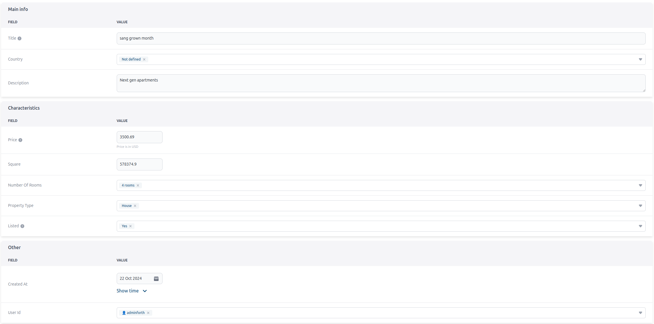
In some cases, you may want to organize data fields into specific groups for better structure and clarity. For example, you could create a "Main Info" group to include columns like title, description, country, and apartment_image. Another group, "Characteristics," could hold attributes such as price, square_meter, number_of_rooms, and listed. Any values without a specified group will be categorized under "Other.
export default {
      ...
      options: {
        ...
        fieldGroups: [
          {
            groupName: 'Main info',
            columns: ['id','title', 'description', 'country']
          },
          {
            groupName: 'Characteristics',
            columns: ['price', 'square_meter', 'number_of_rooms', "listed"]
          }
        ],
      }
    }
Here is how it looks:
You can hide the group title by setting noTitle to true.
export default {
      ...
      options: {
        ...
        fieldGroups: [
          {
            groupName: 'Main info',
            columns: ['id','title', 'description', 'country']
            noTitle: true,
          },
          {
            groupName: 'Characteristics',
            columns: ['price', 'square_meter', 'number_of_rooms', "listed"]
          }
        ],
      }
    }
You can also specify on which page you want to create groups.
export default {
      ...
      options: {
        createFieldGroups: [
          {
            groupName: 'Main info',
            columns: ['id','title']
          },
          {
            groupName: 'Characteristics',
            columns: ['description', 'country', 'price', 'square_meter', 'number_of_rooms', "listed"]
          }
        ],
      }
    }
List
Default Sorting
import { AdminForthSortDirections } from 'adminforth';

...
export default {
  resourceId: 'aparts',
  options: {
    defaultSort: {
      columnName: 'created_at',
      direction: AdminForthSortDirections.asc,
    }
  }
}
Sticky column
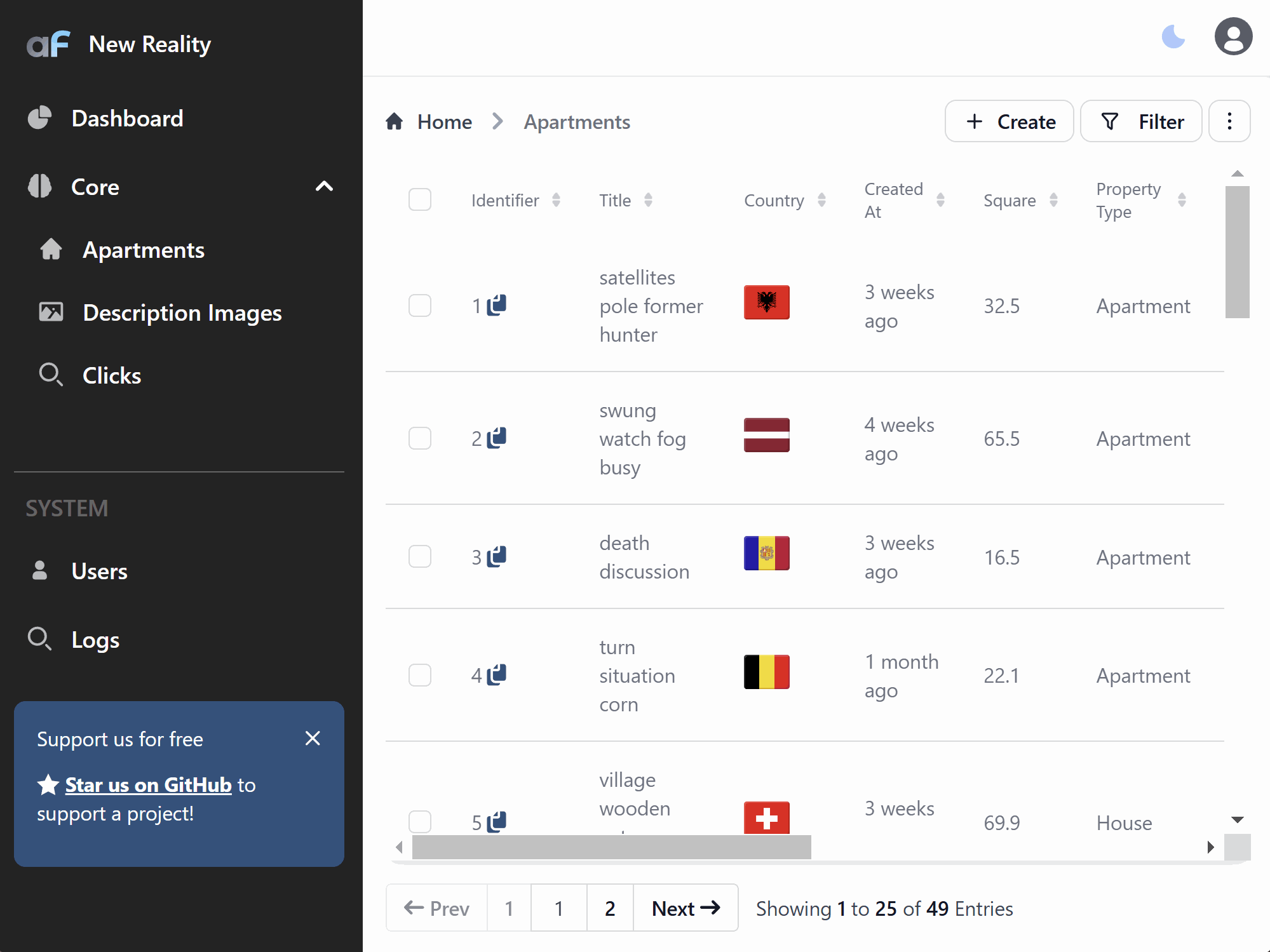
You can make a column sticky in the list view by setting listSticky to true. This keeps the column visible when horizontally scrolling through the table, which is particularly useful for important columns like titles or IDs that should always remain in view.
export default {
  resourceId: 'aparts',
  ...
  columns: [
  {
    name: "title",
    listSticky: true,
    ...
  },
  ...
  ]
}
⚠️ Please note that sticky columns can only be applied to one column per resource.
Conditional display
You can conditionally display columns in forms and views based on the values of other fields in the current record using the showIf property. This enables dynamic layouts that automatically adapt to user input, creating more intuitive and context-aware interfaces.
export default {
  resourceId: 'aparts',
  columns: [
    {
      name: 'apartment_type',
      enum: [
        { value: 'studio', label: 'Studio' },
        { value: 'apartment', label: 'Apartment' },
        { value: 'penthouse', label: 'Penthouse' }
      ]
    },
    {
      name: 'number_of_rooms',
      type: AdminForthDataTypes.INTEGER,
      showIf: { apartment_type: { $not: 'studio' } }
    },
    {
      name: 'has_balcony',
      type: AdminForthDataTypes.BOOLEAN,
      showIf: { apartment_type: 'penthouse' }
    }
  ]
}
Logical Operators
Use $and and $or operators to create complex conditional logic:
export default {
  columns: [
    {
      name: 'premium_features',
      type: AdminForthDataTypes.JSON,
      showIf: {
        $and: [
          { price: { $gte: 500000 } },
          { apartment_type: { $in: ['penthouse', 'apartment'] } }
        ]
      }
    },
    {
      name: 'discount_reason',
      type: AdminForthDataTypes.STRING,
      showIf: {
        $or: [
          { price: { $lt: 100000 } },
          { listed: false }
        ]
      }
    }
  ]
}
Comparison Operators
Use various comparison operators for numeric and string fields:
export default {
  columns: [
    {
      name: 'luxury_amenities',
      showIf: { square_meter: { $gt: 100 } }
    },
    {
      name: 'budget_options',
      showIf: { price: { $lte: 200000 } }
    },
    {
      name: 'special_offers',
      showIf: { country: { $nin: ['US', 'GB'] } }
    }
  ]
}
Array Operators
For fields that contain arrays, use array-specific operators:
export default {
  columns: [
    {
      name: 'pet_policy',
      showIf: { amenities: { $includes: 'pet_friendly' } }
    },
    {
      name: 'security_deposit',
      showIf: { features: { $nincludes: 'furnished' } }
    }
  ]
}
Available Operators
The following operators are available for use in showIf conditions:
Equality Operators:
$eq- Equal to (default if no operator specified){ price: { $eq: 100000 } }or{ price: 100000 }
$not- Not equal to{ apartment_type: { $not: 'studio' } }
Comparison Operators:
$gt- Greater than{ square_meter: { $gt: 100 } }
$gte- Greater than or equal to{ price: { $gte: 500000 } }
$lt- Less than{ price: { $lt: 100000 } }
$lte- Less than or equal to{ price: { $lte: 200000 } }
Array Operators:
$in- Value is in array{ apartment_type: { $in: ['penthouse', 'apartment'] } }
$nin- Value is not in array{ country: { $nin: ['US', 'GB'] } }
$includes- Array includes value{ amenities: { $includes: 'pet_friendly' } }
$nincludes- Array does not include value{ features: { $nincludes: 'furnished' } }
Logical Operators:
$and- Logical AND operation{ $and: [{ price: { $gte: 500000 } }, { listed: true }] }
$or- Logical OR operation{ $or: [{ price: { $lt: 100000 } }, { listed: false }] }
⚠️ Warning: When using
showIfwith complex conditions, ensure that:
$andand$oroperators contain arrays of conditions$inand$ninoperators contain arrays of values$includesand$nincludesoperators are only used on columns marked as arrays (isArray: { enabled: true })
Page size
use options.listPageSize to define how many records will be shown on the page
export default {
      resourceId: 'aparts',
      options: {
        ...
        listPageSize: 10,
      }
    }
  ]
Virtual scroll
Set options.listVirtualScrollEnabled to true to enable virtual scrolling in the table. The default value is false. Enable this option if you need to display a large number of records on a single page.
export default {
      resourceId: 'aparts',
      options: {
        ...
        listVirtualScrollEnabled: true,
      }
    }
  ]
Additionally, you can configure options.listBufferSize to specify the number of rows to buffer for virtual scrolling. The default value is 30 rows.
export default {
      resourceId: 'aparts',
      options: {
        ...
        listVirtualScrollEnabled: true,
        listBufferSize: 20,
      }
    }
  ]
Custom row click action
By default, when you click on a record in the list view, the show view will be opened.
You can change this behavior by using options.listTableClickUrl.
To disable any action (don't open show) return null:
export default {
      resourceId: 'aparts',
      options: {
        ...
        listTableClickUrl: async (record, adminUser, resource) => null,
      }
    }
  ]
To open a custom page, return URL to the custom page (can start with https://, or relative adminforth path):
      options: {
        ...
        listTableClickUrl: async (record, adminUser, resource) => {
          return `https://google.com/search?q=${record.title}`;
        }
      }
If you wish to open the page in a new tab, add target=_blank get param to the returned URL:
      options: {
        ...
        listTableClickUrl: async (record, adminUser, resource) => {
          return `https://google.com/search?q=${record.name}&target=_blank`;
        }
      }
How to open edit instead of show by click in list table
By using options.listTableClickUrl you can open edit view by clicking record, instead of show view:
      options: {
        ...
        listTableClickUrl: async (record, adminUser, resource) => {
          return `/resource/${resource.resourceId}/edit/${record[pkFileldName]}`;
        }
      }
Auto-refresh records
options.listRowsAutoRefreshSeconds might be used to silently refresh records that are loaded (no new records will be fetched if
they appear)
export default {
        resourceId: 'aparts',
        hooks: {
          list: {
            afterDatasourceResponse: async ({ response }: { response: any }) => {
              response.forEach((r: any) => {
                // substitute random country on any load
                const countries = [ 'US', 'DE', 'FR', 'GB', 'NL', 'IT', 'ES', 'DK', 'PL', 'UA',
                  'CA', 'AU', 'BR', 'JP', 'CN', 'IN', 'KR', 'TR', 'MX', 'ID']
                r.country = countries[Math.floor(Math.random() * countries.length)];
              })
              return { ok: true, error: "" }
            }
          }
        },
        options: {
          ...
          listRowsAutoRefreshSeconds: 1,
        }
      }
  ]
Move base actions out of three dots menu
If you want to move base record actions from the three dots menu, you can add baseActionsAsQuickIcons:
  options: {

    ...

    baseActionsAsQuickIcons: ['edit'],

    ...

  }
And edit action will be available as quick action:
Creating
Fill with default values
Sometimes you want to generate some field value without asking user to fill it. For example createdAt oftenly store time of creation of the record. You can do this by using fillOnCreate:
export default {
      name: 'apartments',
      fields: [
        ...
        {
          name: 'created_at',
          type: AdminForthDataTypes.DATETIME,
          showIn: {
            all: true,
            create: false,  // don't show field in create form
          },
          fillOnCreate: ({ initialRecord, adminUser }) => (new Date()).toISOString(),
        },
      ],
    },
    ...
  ],
Also you can assign adminUser ID by adminUser.dbUser.id:
export default {
      name: 'apartments',
      fields: [
        ...
        {
          name: 'created_by',
          type: AdminForthDataTypes.STRING,
          showIn: {
            all: true,
            create: false,  // don't show field in create form
          },
          fillOnCreate: ({ initialRecord, adminUser }) => adminUser.dbUser.id,
        },
      ],
    },
    ...
  ],
Same effect can be achieved by using hooks. But
fillOnCreatemight be shorter and more readable.
Suggest default value in create form
You can suggest a default value for a field in the create form which user can instantly change even before creating record. This might be used to give user some example value or to suggest some default value.
export default {
      name: 'apartments',
      fields: [
        ...
        {
          name: 'description',
          suggestOnCreate: 'Great apartment in the heart of the city',
        },
      ],
    },
    ...
A difference between fillOnCreate and suggestOnCreate:
fillOnCreateis called on the backend when the record is saved to a database. Value returned byfillOnCreatewill be saved to the database.suggestOnCreateis just a single value that will be substituted in create form. User can change it before saving the record.fillOnCreateshould be used whenshowIn.createis afalsevalue because if it istrue, the input will be shown in the create form but then(during actual save to db) it will be overwritten by the value returned byfillOnCreate.suggestOnCreateshould be used withshowIn.createset to true because if it is not set, the input will not be shown in the create form and default suggestion will not make sense.
Link to create form with preset values
Sometimes you might need to create a link that will open the create form with some fields pre-filled. For example, you might want to create a link that will open the create form with the realtor_id field pre-filled with the current user's ID.
<template>
  ...
  <LinkButton
    :to="{
      name: 'resource-create',
      params: {
        resourceId: 'aparts',
      },
      query: {
        values: atob_function(JSON.stringify({
          realtor_id: coreStore?.adminUser.dbUser.id
        })),
      },
    }"
  >
    {{$t('Create new apartment')}}
  </LinkButton>
  ...
</template>

<script setup lang="ts">
import { LinkButton } from '@afcl';
import { useCoreStore } from '@/stores/core';
import { btoa_function } from '@/utils';

const coreStore = useCoreStore();
</script>
ALso if you want to disable ability to change such fields (but keep them as readonly) you can add readonlyColumns to the link:
<template>
  ...
  <LinkButton
    :to="{
      name: 'resource-create',
      params: {
        resourceId: 'aparts',
      },
      query: {
        values: (JSON.stringify({
          realtor_id: coreStore?.adminUser.dbUser.id
        })),
        readonlyColumns: (JSON.stringify(['realtor_id'])),
      },
    }"
  >
    {{$t('Create new apartment')}}
  </LinkButton>
  ...
Editing
You can set a column editReadonly so it will be shown in the edit form but will be disabled.
This might be useful to better identify the record during editing or to show some additional information that should not be changed but can help to edit the record.
export default {
      name: 'apartments',
      fields: [
        ...
        {
          name: 'created_at',
          type: AdminForthDataTypes.DATETIME,
          editReadonly: true,
        },
      ],
    },
    ...
  ],
editReadonlyis check enforced both on fronted and backend. So it is safe to use it to make sure that data will be never changes.
minValue and maxValue
You can add minValue and maxValue limits to columns, so it will show an error below an input when entered value is out of bounds.
export default {
      name: 'apartments',
      columns: [
        ...
        {
          name: 'square_meter',
          label: 'Square',
          minValue: 3,
          maxValue: 1000,
        },
      ],
    },
    ...
  ],
minValueandmaxValuechecks are enforced both on frontend and backend.
Validation
In cases when column values must follow certain format, you can add validation to it.
validation is an array of rules, each containing regExp that defines a format for a value and message that will be displayed in case when entered value does not pass the check.
export default {
      name: 'adminuser',
      columns: [
        ...
        {
          name: 'email',
          required: true,
          isUnique: true,
          validation: [
            {
              regExp: '^[a-zA-Z0-9._%+-]+@[a-zA-Z0-9.-]+\\.[a-zA-Z]{2,}$',
              message: 'Email is not valid, must be in format example@test.com',
            },
          ],
        },
      ],
    },
    ...
  ],
validationchecks are enforced both on frontend and backend.
Input prefix and suffix
You can add prefix or suffix to inputs by adding inputPrefix or inputSuffix fields to a column.
export default {
      name: 'users',
      columns: [
        ...
        {
          name: "price",
          inputSuffix: "USD",
          allowMinMaxQuery: true,
        },
      ],
    },
    ...
  ],
These fields can only be used with following AdminForthDataTypes: DECIMAL, FLOAT, INTEGER, STRING and JSON (only if JSON column is an array with appropriate itemType).
Editing note
You can add editingNote to a column to show a note below the input field.
export default {
      name: 'adminuser',
      columns: [
        ...
        {
          name: "password",
          editingNote: { edit: "Leave empty to keep password unchanged" },
        },
      ],
    },
    ...
  ],
Filling an array of values
Whenever you want to have a column to store not a single value but an array of values you have to set column as AdminForthDataTypes.JSON. This way when you are creating or editing a record you can type in a JSON array into a textfield. To simplify this process and allow you to create and edit separate items you can add isArray to a column.
export default {
      name: 'adminuser',
      columns: [
        ...
        {
          name: "room_sizes",
          type: AdminForthDataTypes.JSON,
          isArray: {
            enabled: true,
            itemType: AdminForthDataTypes.FLOAT,
          },
        },
      ],
    },
    ...
  ],
Doing so, will result in UI displaying each item of the array as a separate input corresponding to isArray.itemType on create and edit pages.
itemType value can be any of AdminForthDataTypes except JSON and TEXT.
By default it is forbidden to store duplicate values in an array column. To change that you can add allowDuplicateItems: true to isArray, like so:
export default {
      name: 'adminuser',
      columns: [
        ...
        {
          name: "room_sizes",
          type: AdminForthDataTypes.JSON,
          isArray: {
            enabled: true,
            itemType: AdminForthDataTypes.FLOAT,
            allowDuplicateItems: true,
          },
        },
      ],
    },
    ...
  ],
All validation rules, such as minValue, maxValue, minLength, maxLength and validation will be applied not to array itself but instead to each item.
Note: array columns can not be marked as masked, be a primaryKey and at the time can not be linked to a foreign resource.
Foreign resources
When you want to create a connection between two resources, you need to add foreignResource to a column, like so:
export default {
      name: 'adminuser',
      columns: [
        ...
        {
          name: "realtor_id",
          foreignResource: {
            resourceId: 'adminuser',
          },
        },
      ],
    },
    ...
  ],
This way, when creating or editing a record you will be able to choose value for this field from a dropdown selector and on list and show pages this field will be displayed as a link to a foreign resource.
Unset label
When foreign resource column is not required, selector will have an 'Unset' option that will set field to null. You can change label for this option using unsetLabel, like so:
export default {
      name: 'apartments',
      columns: [
        ...
        {
          name: "realtor_id",
          foreignResource: {
            resourceId: 'adminuser',
            unsetLabel: 'No realtor',
          },
        },
      ],
    },
    ...
  ],
Searchable fields
Enable search in filter dropdown by specifying which fields to search:
export default {
      name: 'apartments',
      columns: [
        ...
        {
          name: "realtor_id",
          foreignResource: {
            resourceId: 'adminuser',
            searchableFields: ["id", "email"],
            searchIsCaseSensitive: true, // default false
          },
        },
      ],
    },
    ...
  ],
Polymorphic foreign resources
Sometimes it is needed for one column to be a foreign key for multiple tables. For example, given the following schema:
...
model apartments {
  id                String     @id
  created_at        DateTime?
  title             String
  square_meter      Float?
  price             Decimal
  number_of_rooms   Int?
  realtor_id        String?
}

model houses {
  id                  String     @id
  created_at          DateTime?
  title               String
  house_square_meter  Float?
  land_square_meter   Float?
  price               Decimal
  realtor_id          String?
}

model sold_property {
  id                  String     @id
  created_at          DateTime?
  title               String
  property_id         String
  realtor_id          String?
}
Here, in sold_property table, column property_id can be a foreign key for both apartments and houses tables. If schema is set like this, the is no way to tell to what table exactly property_id links to. Also, if defined like usual, adminforth will link to only one of them. To make sure that property_id works as intended we need add one more column to sold_property and change the way foreign resource is defined in adminforth resource config.
...

model sold_property {
  id                  String     @id
  created_at          DateTime?
  title               String
  property_type       String
  property_id         String
  realtor_id          String?
}
property_type column will be used to store what table id in property_id refers to. And in adminforth config for sold_property table, when describing property_id column, foreign resource field should be defined as follows:
export default {
      name: 'sold_property',
      columns: [
        ...
        {
          name: "property_type",
          showIn: { create: false, edit: false },
        },
        {
          name: "property_id",
          foreignResource: {
            polymorphicResources: [
              {
                resourceId: 'apartments',
                whenValue: 'apartment',
              },
              {
                resourceId: 'houses',
                whenValue: 'house',
              },
            ],
            polymorphicOn: 'property_type',
          },
        },
      ],
    },
    ...
  ],
When defined like this, adminforth will use value in property_type to figure out to what table does id in property_id refers to and properly link them. When creating or editing a record, adminforth will figure out to what table new property_id links to and fill property_type on its own using corresponding whenValue. Note, that whenValue does not have to be the same as resourceId, it can be any string as long as they do not repeat withing polymorphicResources array. Also, since whenValue is a string, column designated as polymorphicOn must also be string. Another thing to note is that, polymorphicOn column (property_type in our case) must not be editable by user, so it must include both create and edit as false in showIn value. Even though, polymorphicOn column is no editable, it can be beneficial to set is as an enumerator. This will have two benefits: first, columns value displayed in table and show page can be changed to a desired one and second, when filtering on this column, user will only able to choose values provided for him.
If beforeDatasourceRequest or afterDatasourceResponse hooks are set for polymorphic foreign resource, they will be called for each resource in polymorphicResources array.
Filtering
Filter Options
You can specify the delay between filtering requests and filtering operator for a column using filterOptions field.
export default {
      name: 'adminuser',
      columns: [
        ...
        {
          name: "title",
          required: true,
          maxLength: 255,
          minLength: 3,
          filterOptions: {
            debounceTimeMs: 500,
            substringSearch: false,
          },
        },
      ],
    },
    ...
  ],
debounceTimeMs field dictates how long (in milliseconds) to wait between inputs to send updated data request. By increasing this value, you can reduce the amount of requests set to backend. Default value for this field is set to 10ms.
substringSearch sets what comparison operator to use for text field. By default this field is set to true, which results in using case-insensitive ILIKE operator, that will look for records that have filter string anywhere inside field value. Setting this substringSearch to false will result in using more strict EQ operator, that will look for exact full-string matches.
You can also disabled multiselect on filter page for enumerator columns or foreign resource columns by adding multiselect field:
export default {
      name: 'adminuser',
      columns: [
        ...
        {
          name: "parentUserId",
          foreignResource: {
            resourceId: "users",
          },
          filterOptions: {
            multiselect: false,
          },
        },
      ],
    },
    ...
  ],
This way, multiselect field displayed on filter page will be replaced with a default select field allowing only a single value to be selected.